
UX Design · Mobile App, Interface Design
Wheel of Lunch
A single-purpose mobile app concept that uses an interactive spinning wheel to help users choose lunch.
Project Details
Mobile App Concept
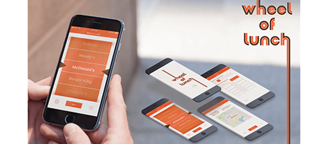
I designed a single-purpose mobile application to solve a common problem: choosing lunch. The user opens the app, spins a wheel, and gets a restaurant suggestion instantly.
Research
The target audience was working professionals and students: people who are too busy or too indecisive to choose lunch on their own. The concept relied on simplicity: one interaction, one outcome.
Ideation and Sketches
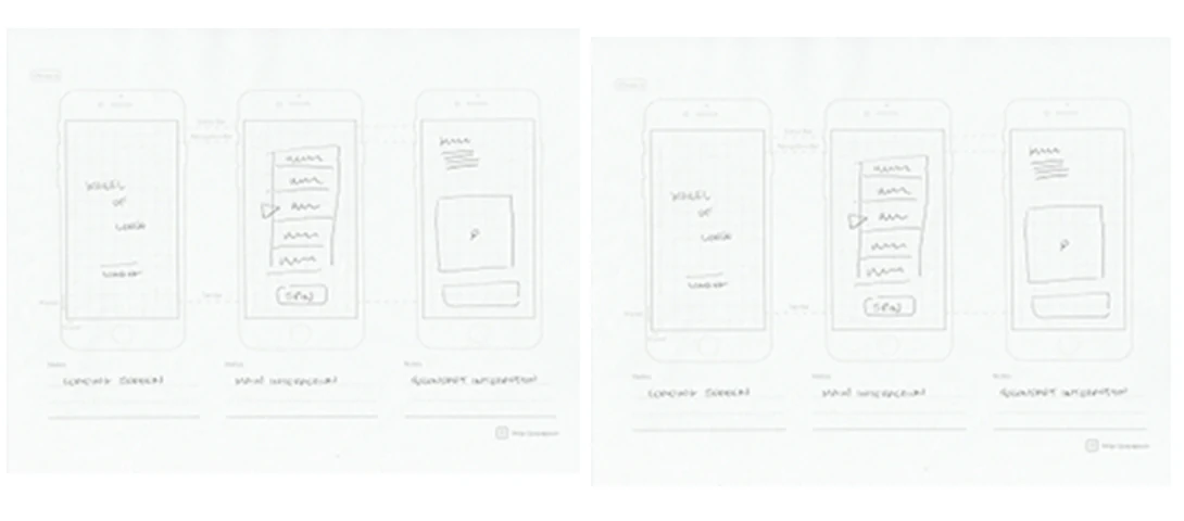
I sketched a few rough layouts to understand how the spinning wheel would fit into a mobile screen. The priority was keeping the interface clean and the interaction intuitive. The visual direction leaned toward a retro aesthetic, with warm colors and hand-drawn elements that gave the app a friendly, approachable feel.
Digital Concepts
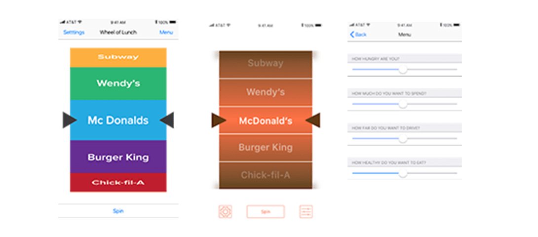
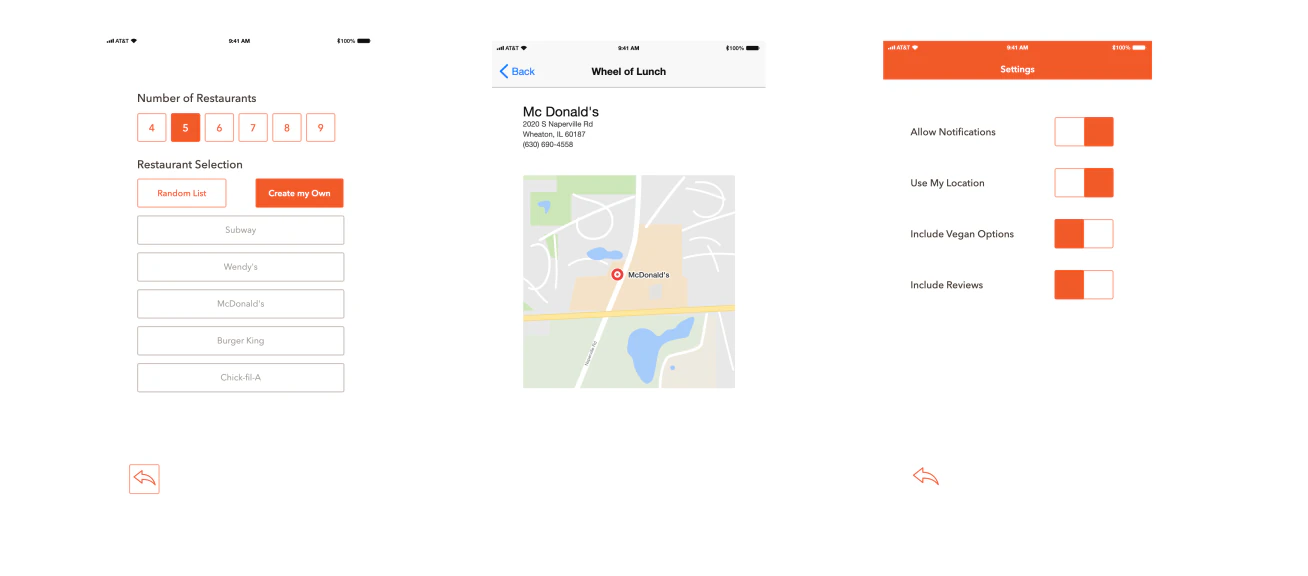
I narrowed down the color scheme and established a general layout for the main screens. One key requirement was the number of screens the project needed to include, which shaped the overall structure of the prototype. I designed each screen to serve a clear purpose in the user flow.
Revisions
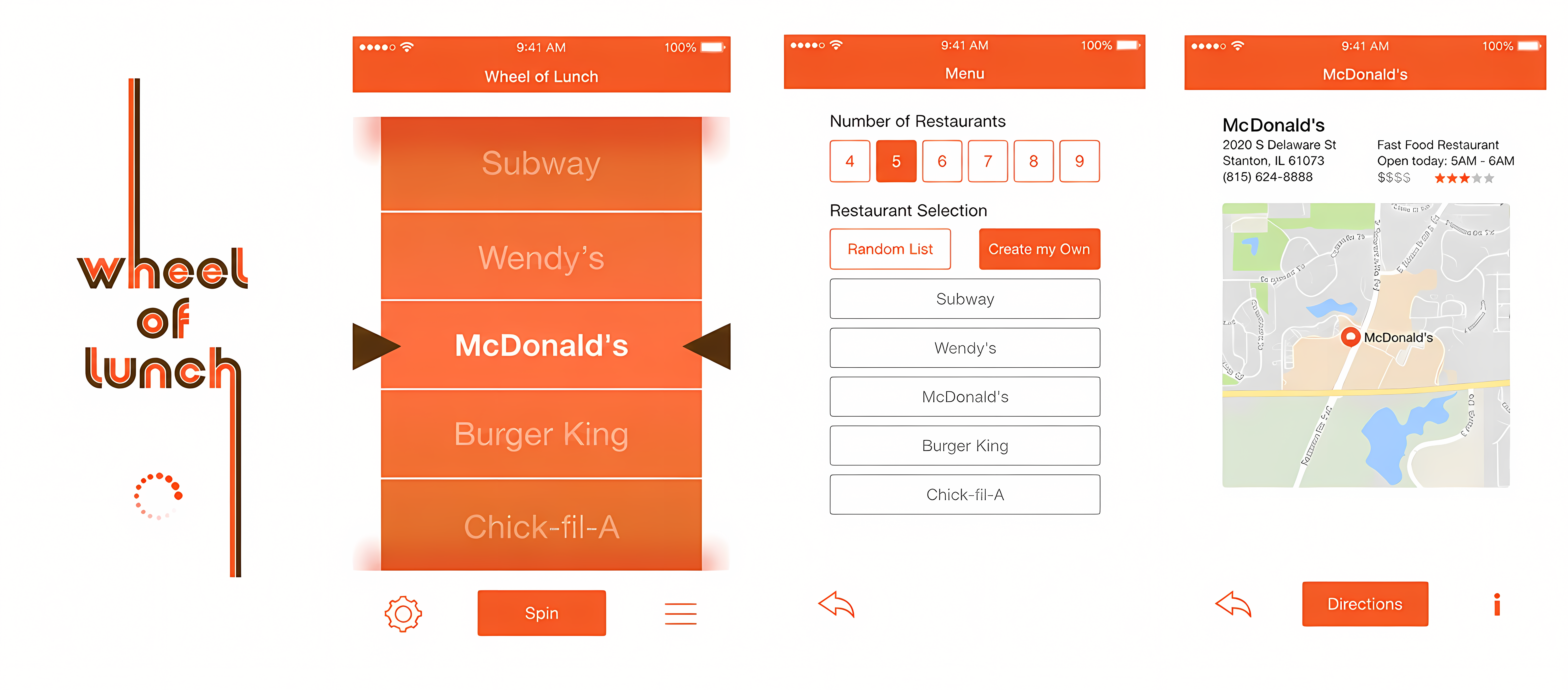
The spinning wheel was the most demanding element of the design. It needed to be interactive, visually satisfying, and responsive to the user’s gesture. I added subtle pocket shadows to give the wheel depth without making the design feel skeuomorphic: a balance between modern minimalism and tactile warmth.
Final Design
The final concept is presented through four screen designs, showing the app’s intended visual experience. The result was a simple, playful interface that made a mundane decision feel like a small moment of fun. I completed this project during the UX class in the fall of 2017.