
Typography · Poster Design, Print
Typography Poster
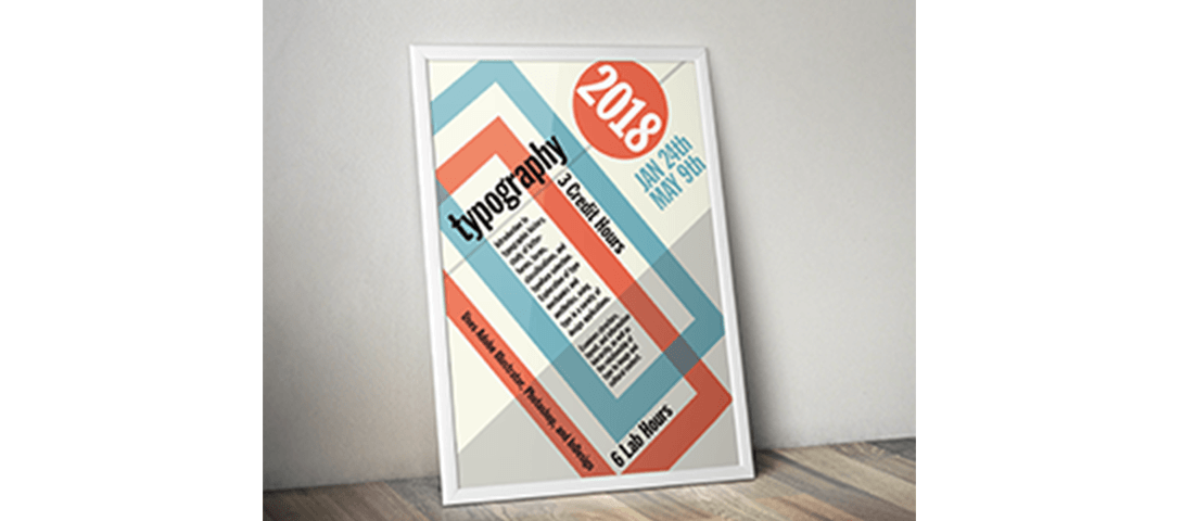
An 11x17 typographic poster for a university design class, using type and vector shapes to establish visual hierarchy.
Project Details
Poster Design
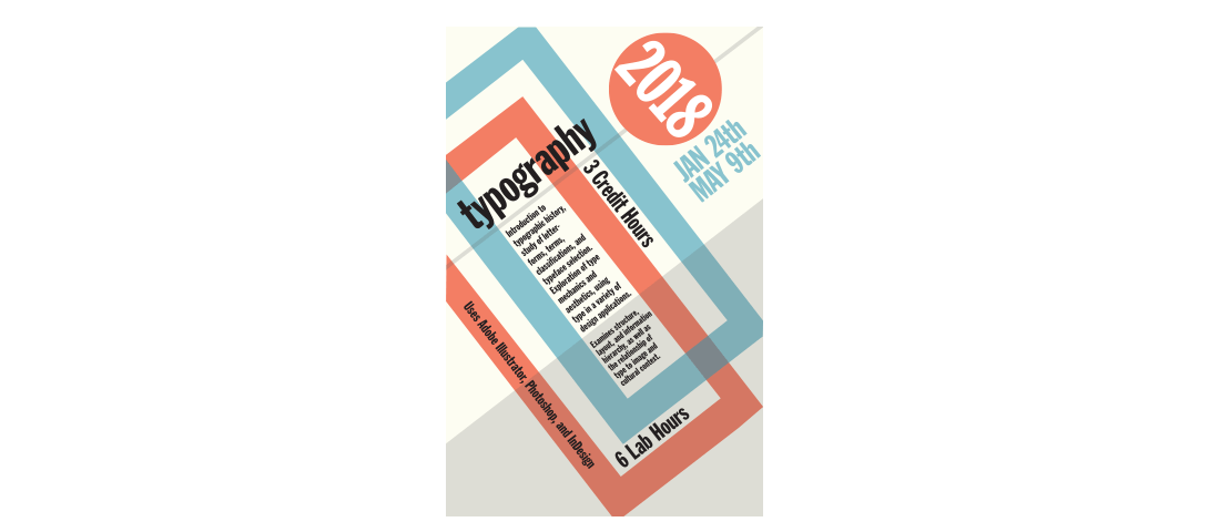
I created an 11x17 typographic poster for the 2018 Typography Class. The assignment used only type, strokes, rules, and vector shapes: no photography or illustration: to communicate a clear visual hierarchy.
Research
The copy was provided; the challenge was making it legible, interesting, and structurally sound. Guidelines suggested using type on a path, transparency, color, and multiple typefaces, though none were required. The goal was to demonstrate the elements and principles of design through typography alone.
Ideation and Sketches
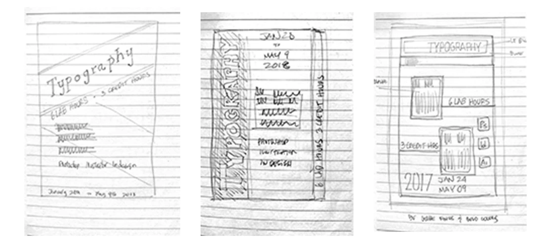
I sketched several thumbnail layouts, testing different arrangements of the provided copy. The priority was establishing a clear reading order; the eye should move naturally from headline to body without confusion. I used contrasting type sizes, weights, and spacing to create sections without relying on rules or borders.
Digital Concepts
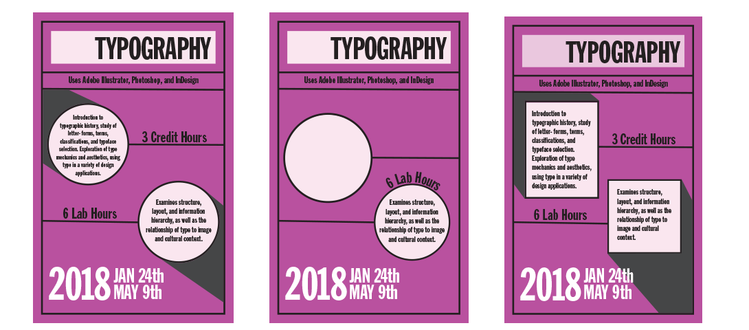
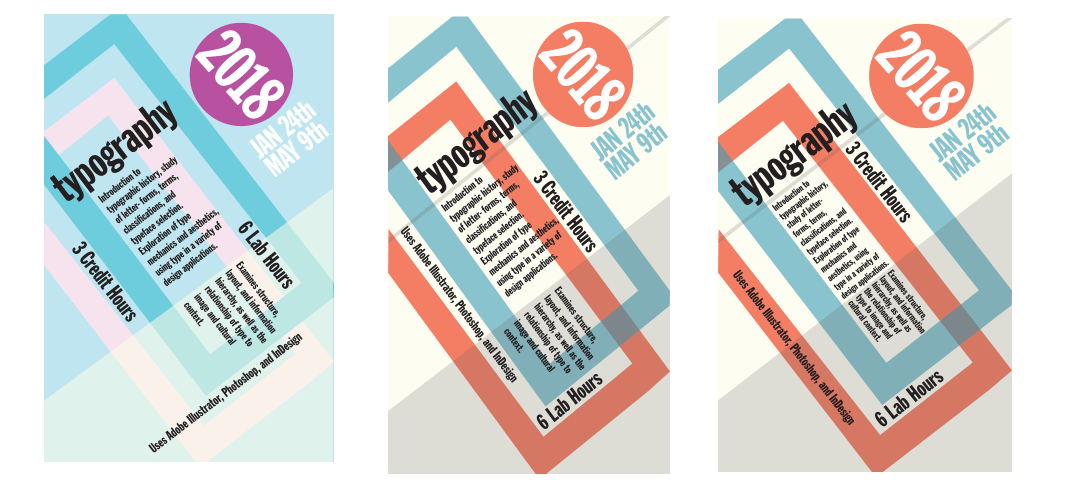
The direction I pursued was Swiss design: grid-based layout, restrained color, and an emphasis on typographic clarity. I developed two full poster versions: one using a CMYK color set and another in monochrome, and refined both through peer and instructor feedback. Adjustments focused on type sizing, color balance, and the spacing between typographic blocks.
Revisions
Even with two strong options, the Swiss design felt like the right fit. Its principles: minimalism, grid structure, and visual honesty, aligned with the content and with my own aesthetic. I chose the Swiss version and spent additional time tightening the grid, adjusting type sizes, and ensuring every element earned its place on the page.
Final Design
I submitted the Swiss design as the final poster. The assignment taught me that hierarchy is not just about making things bigger or bolder; it is about creating a system where each element has a clear role. The result was a poster that communicated effectively and felt cohesive, which was the goal from the start.