
Editorial Design · Magazine Design, Typography, Art Direction, Layout
Two Days in Rome
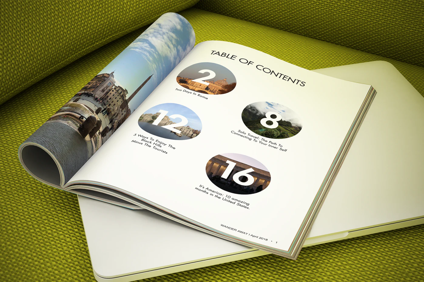
Magazine layout design for an independent student-life publication featuring college culture and travel.
Project Details
Magazine Layout Design
I designed and produced a letter-size independent magazine: 20 interior pages and four cover spreads, documenting college student life and culture through student-authored articles and original photography.
Research
The magazine’s target audience was college students. The category was lifestyle, and the editorial voice needed to feel current without sacrificing readability. I defined the title and tagline, then began assembling the content that would give the publication structure.
Ideation and Sketches
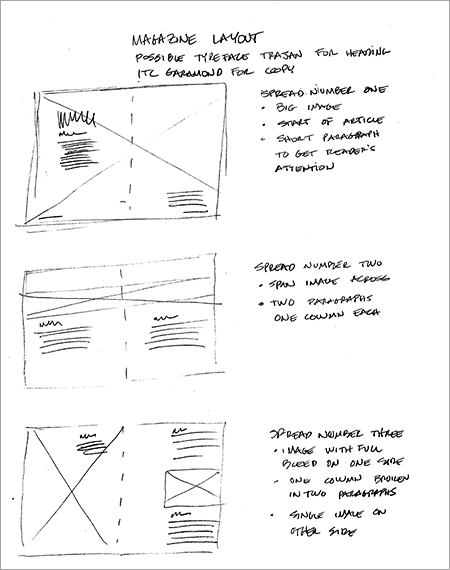
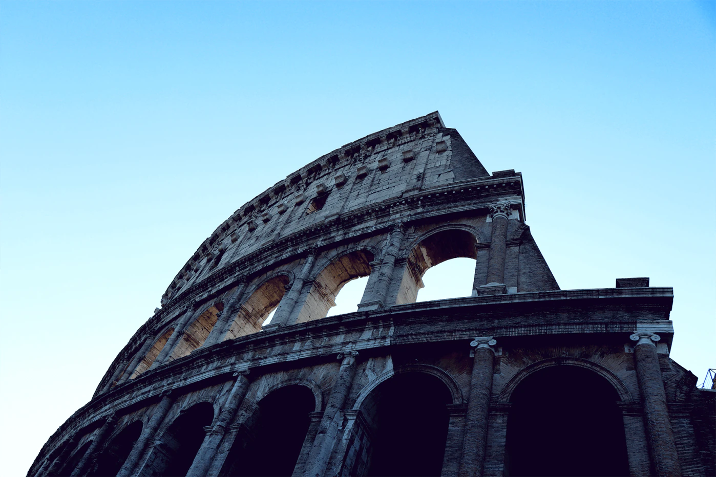
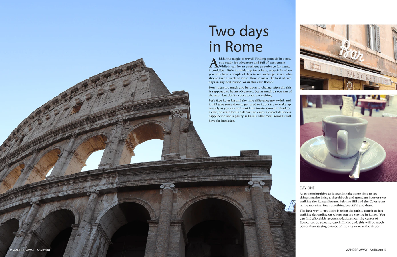
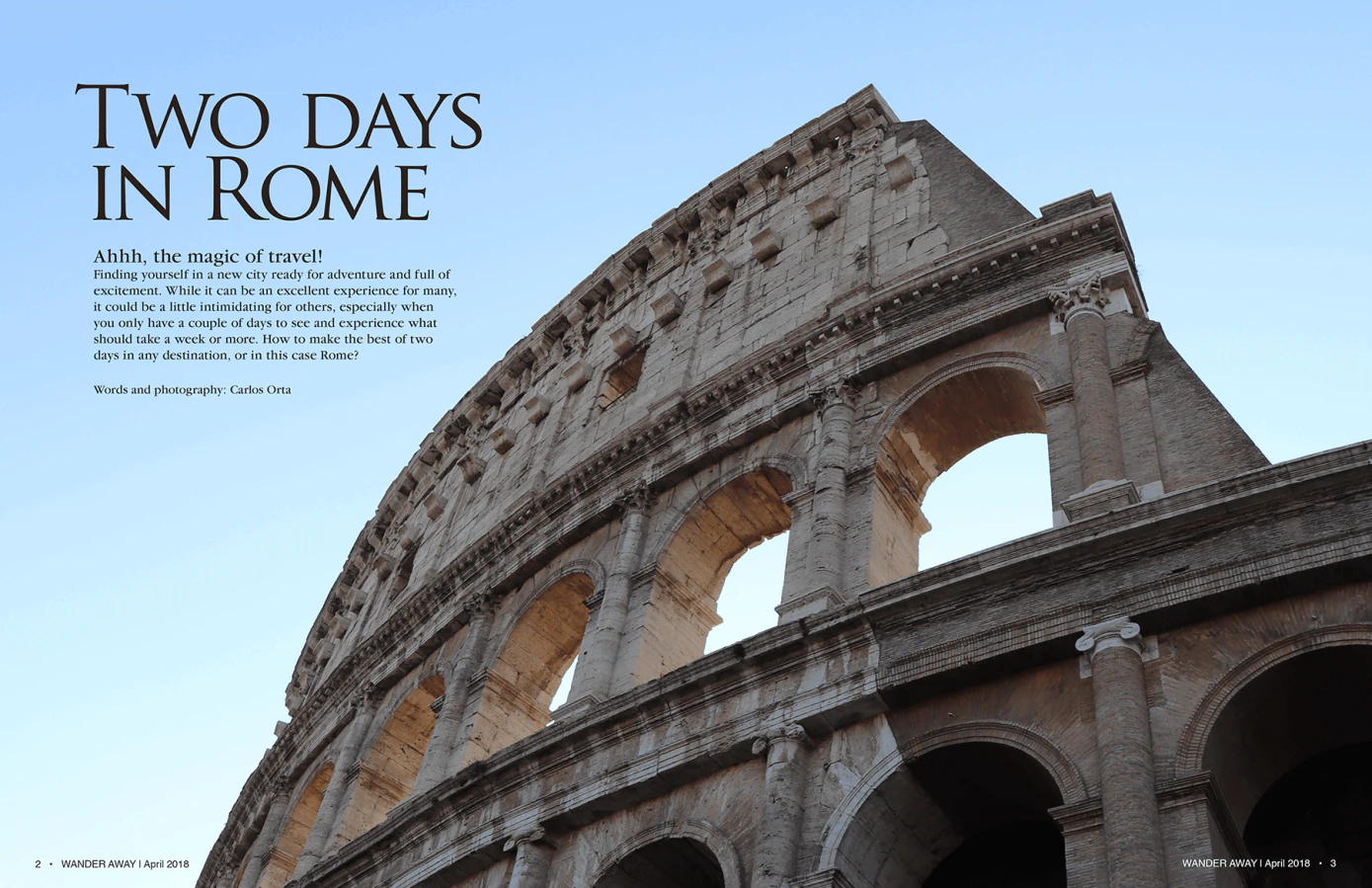
The centerpiece of the magazine was a travel article I authored: a two-day itinerary through Rome, illustrated with photographs from a trip I had taken. I sketched a rough layout for the six-page article, choosing spreads that would let the photography and typography breathe across facing pages.
I also gathered photography and copy from three other students, designing each contribution as a distinct spread while maintaining a consistent visual identity across the full twenty pages. Coordinating those separate pieces was the most demanding part of the project.
Typography
For the article title, I chose Trajan: a classic serif that reads as both authoritative and elegant. The body copy and headings used Garamond ITC, a more traditional serif suited to longer passages. The contrast between the two typefaces established a clear hierarchy between headline, subhead, and body text.
Peer and instructor feedback pointed to a need for more negative space. I adjusted image sizing, increased margins, and removed crowded elements to let each spread find its own balance.
Revisions
A well-balanced layout took several iterations. I experimented with font styles, sizes, and color to establish a cohesive visual system. Every element had to serve a purpose; nothing was decorative for its own sake. I used negative space to guide the reader’s eye through each composition, creating rhythm and preventing the pages from feeling cluttered.
Final Design
I exported the InDesign file as a PDF and sent a printed proof to Blurb, the professional printing service. Seeing the magazine in print confirmed the value of the negative space decisions: the spreads felt open and intentional rather than cramped.
The magazine remains part of my student work portfolio.