
Editorial Design · Layout Design, Photography, Brand Identity
Travel Lite Magazine
An academic group editorial-design project featuring a high-fidelity travel publication with original layout, photography, and visual identity.
 Opens the full-size image in a new tab.
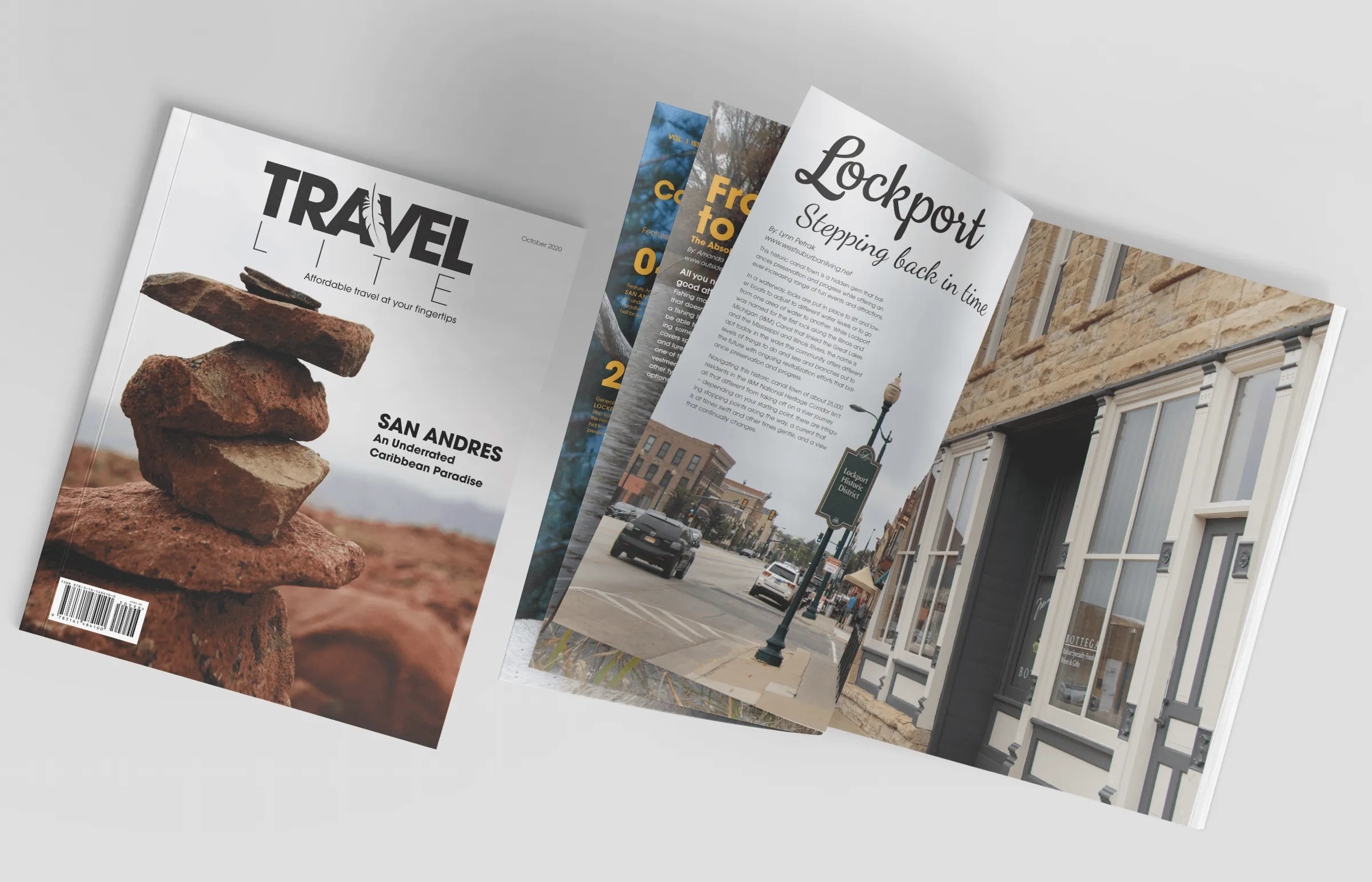
Cover and sample spreads from the October 2020 issue. 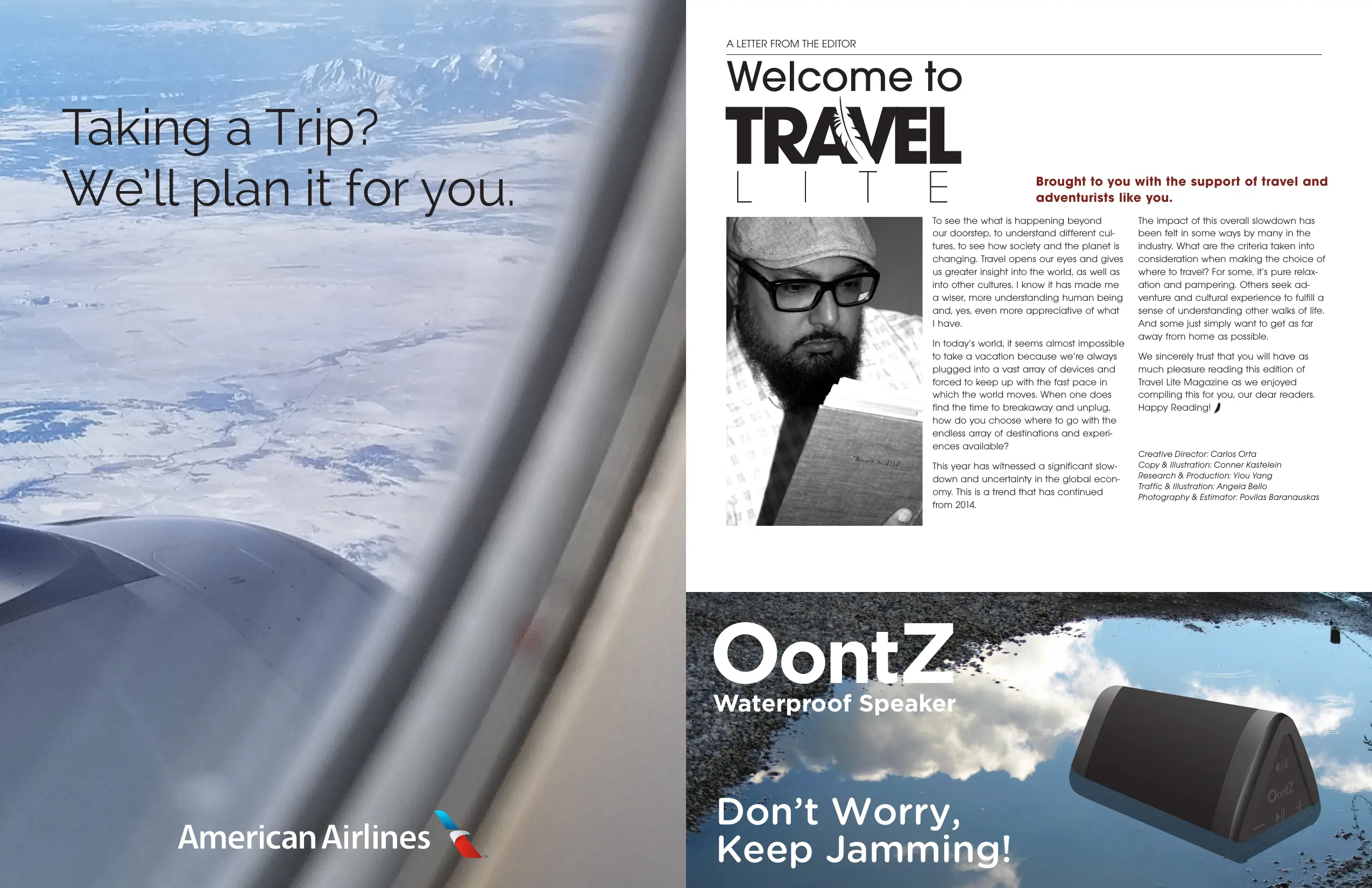 Opens the full-size image in a new tab.
A Letter from the Editor beside an American Airlines advertisement, with an OontZ speaker advertisement below the letter. 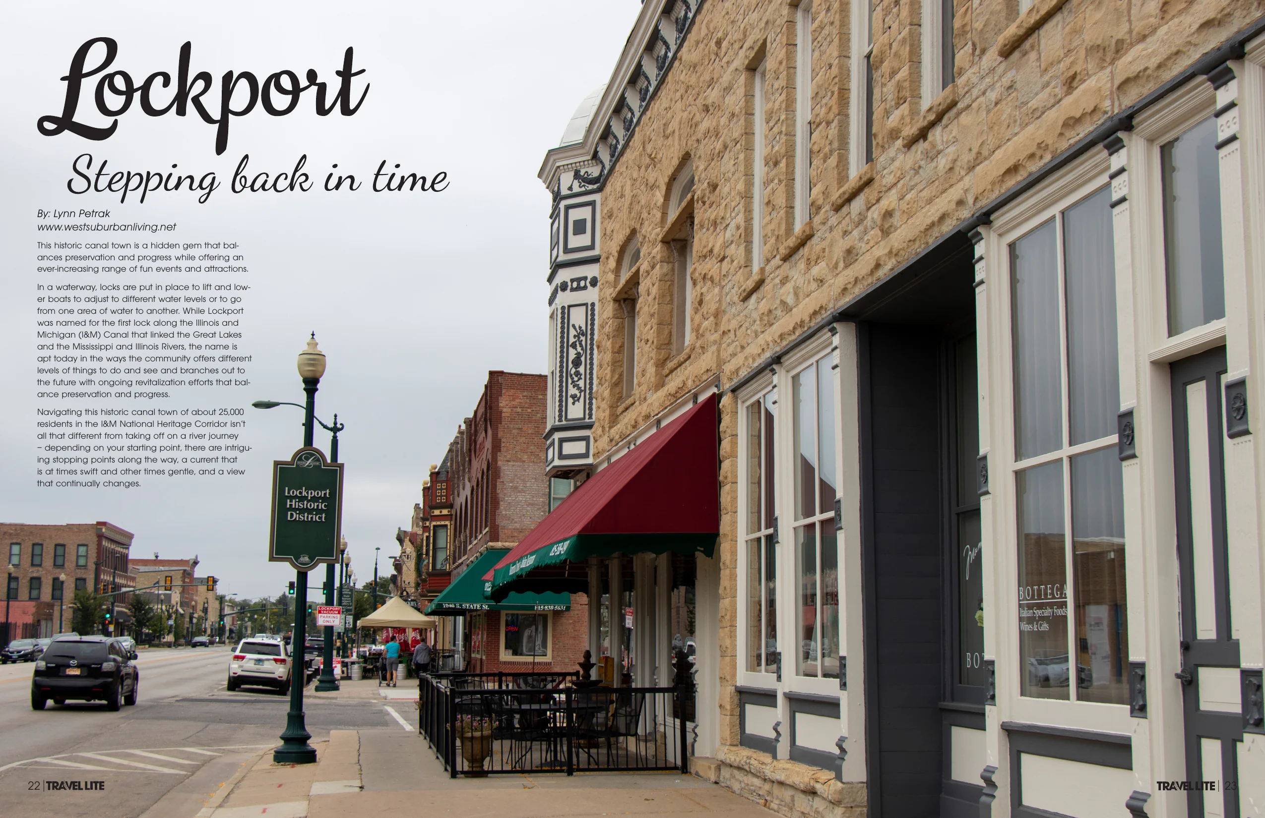 Opens the full-size image in a new tab.
Lockport: Stepping back in time. Opening spread, pages 22 and 23. 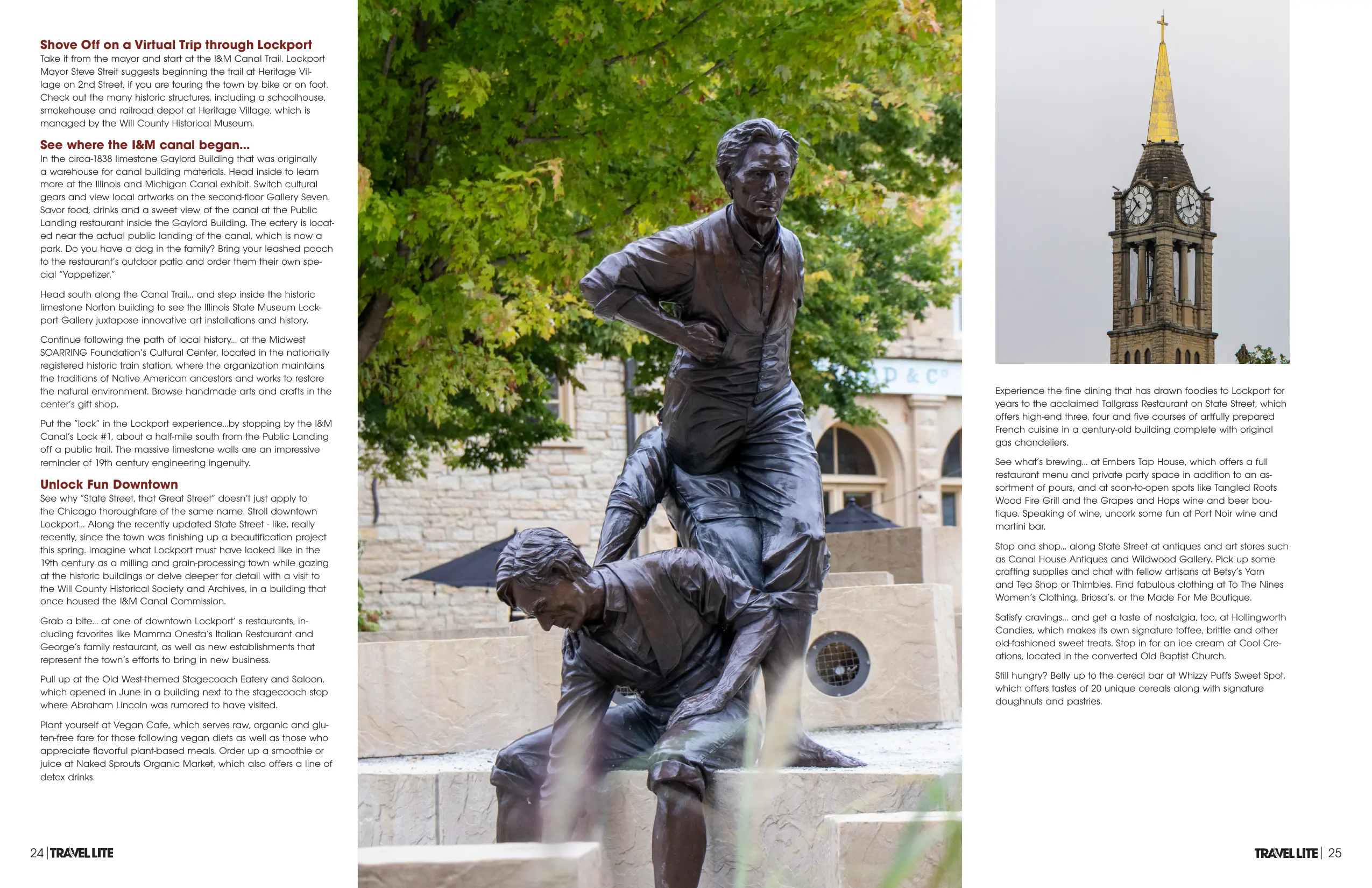 Opens the full-size image in a new tab.
Lockport feature continued, pages 24 and 25. 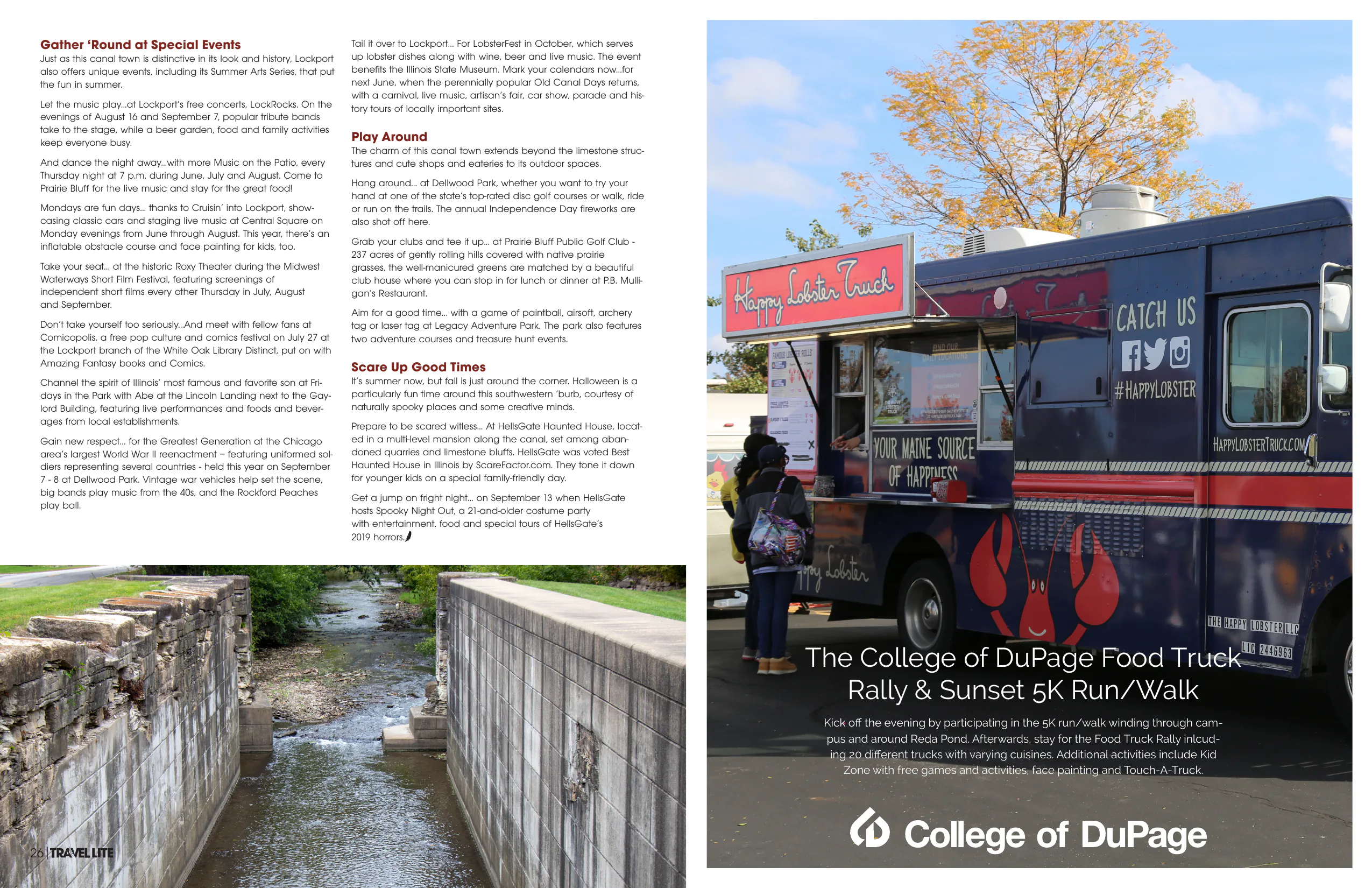 Opens the full-size image in a new tab.
Lockport feature continued, pages 26 and 27, with a College of DuPage advertisement. 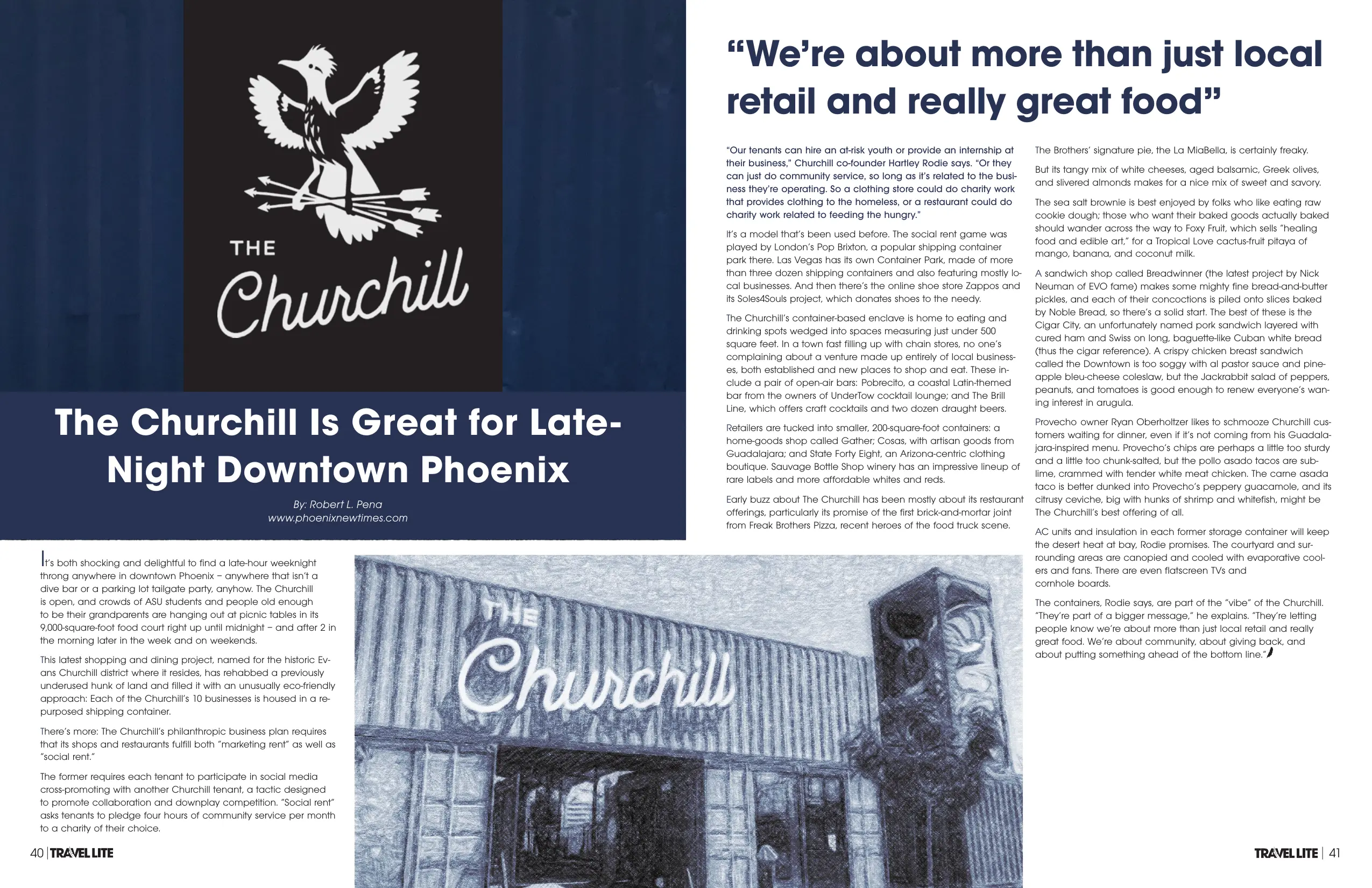 Opens the full-size image in a new tab.
The Churchill, Phoenix. Article spread, pages 40 and 41. 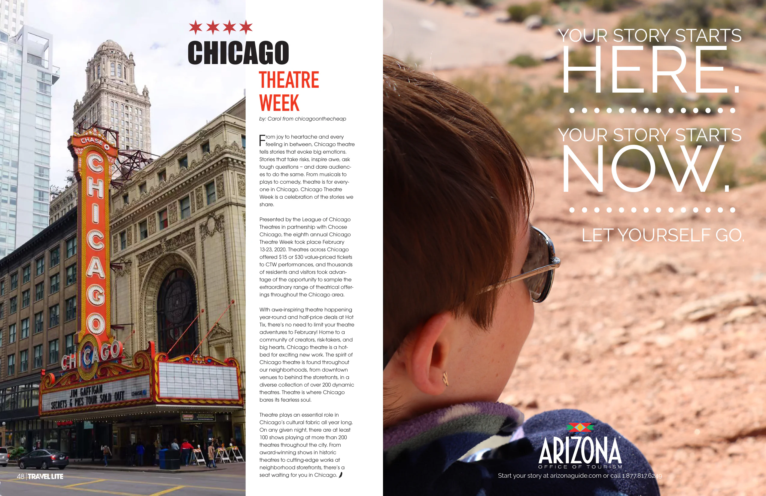 Opens the full-size image in a new tab.
Chicago Theatre Week, page 48, facing an Arizona Office of Tourism advertisement on page 49. 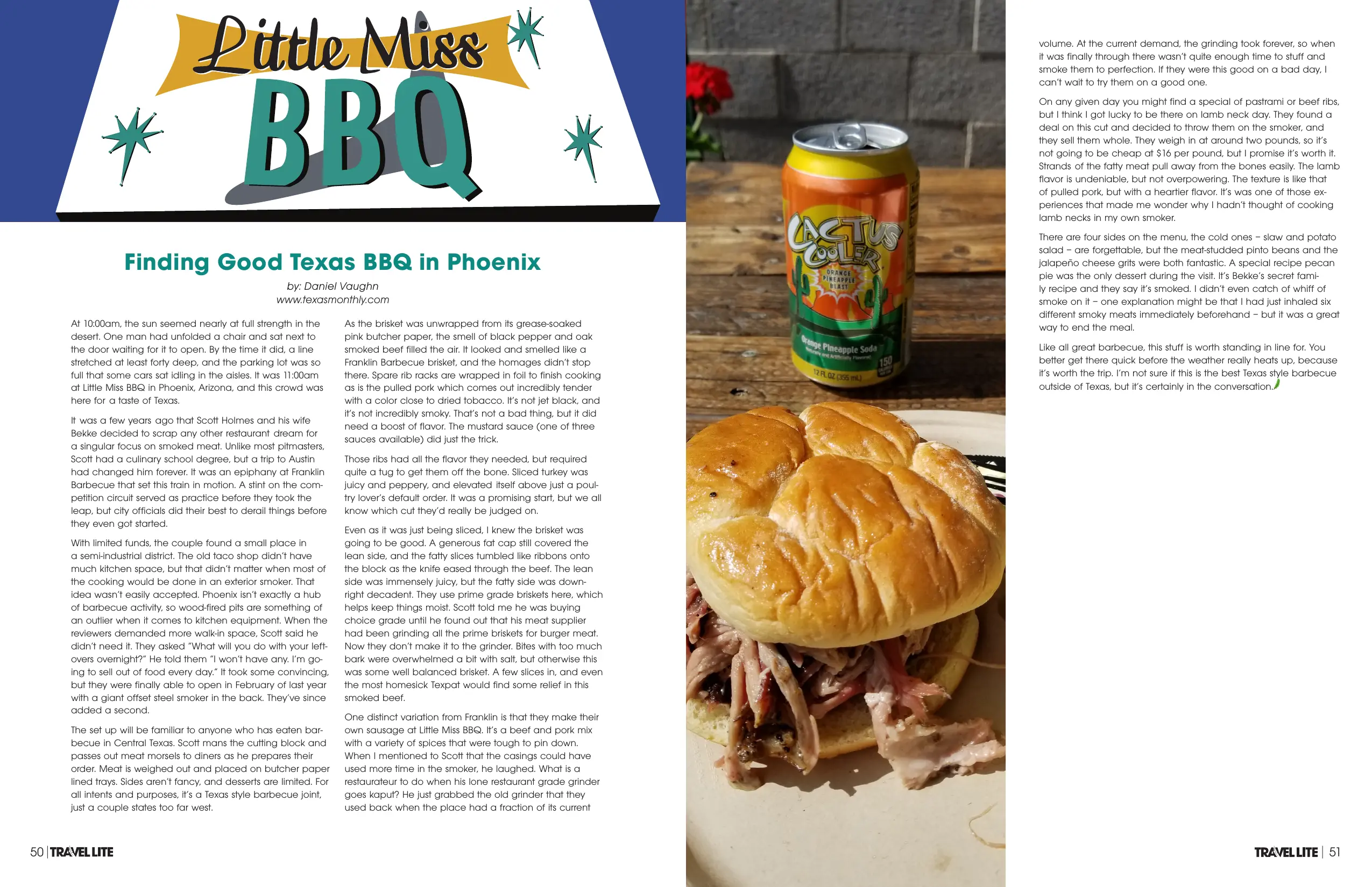 Opens the full-size image in a new tab.
Little Miss BBQ, Phoenix. Article spread, pages 50 and 51. 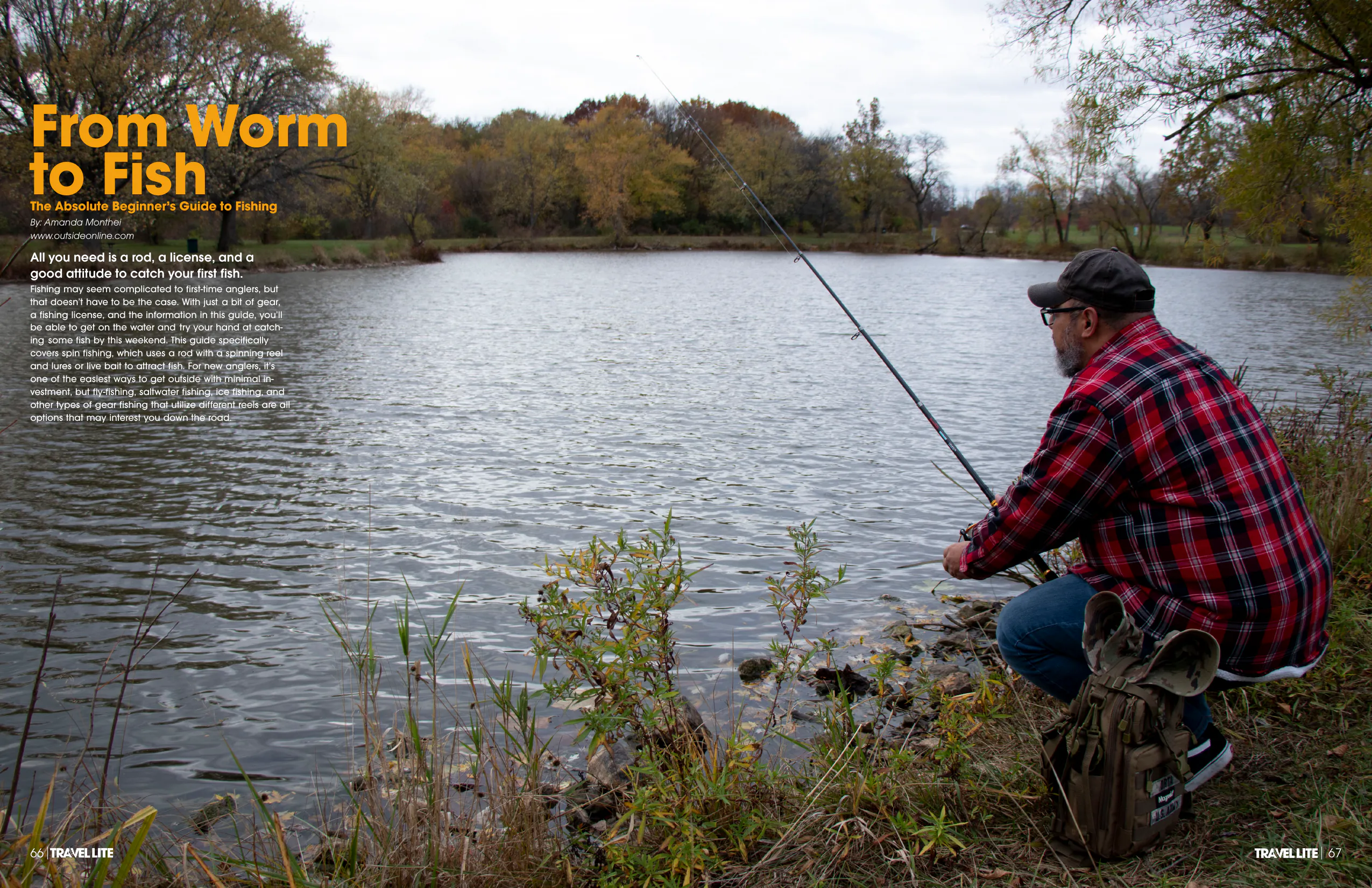 Opens the full-size image in a new tab.
From Worm to Fish. Opening spread, pages 66 and 67. 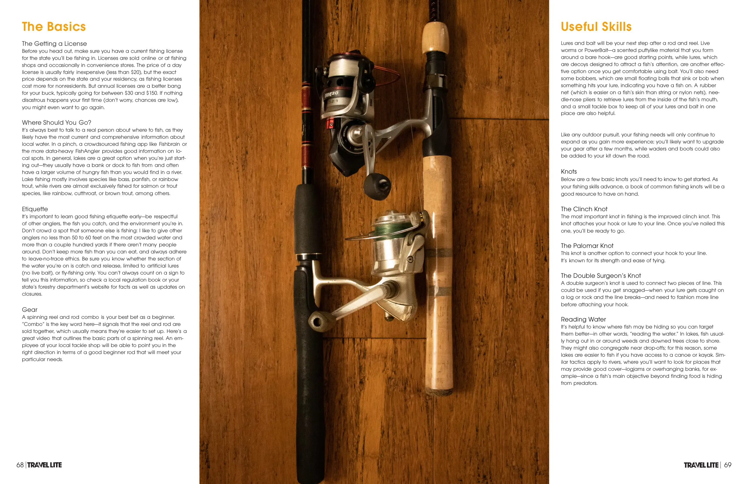 Opens the full-size image in a new tab.
From Worm to Fish continued, pages 68 and 69. 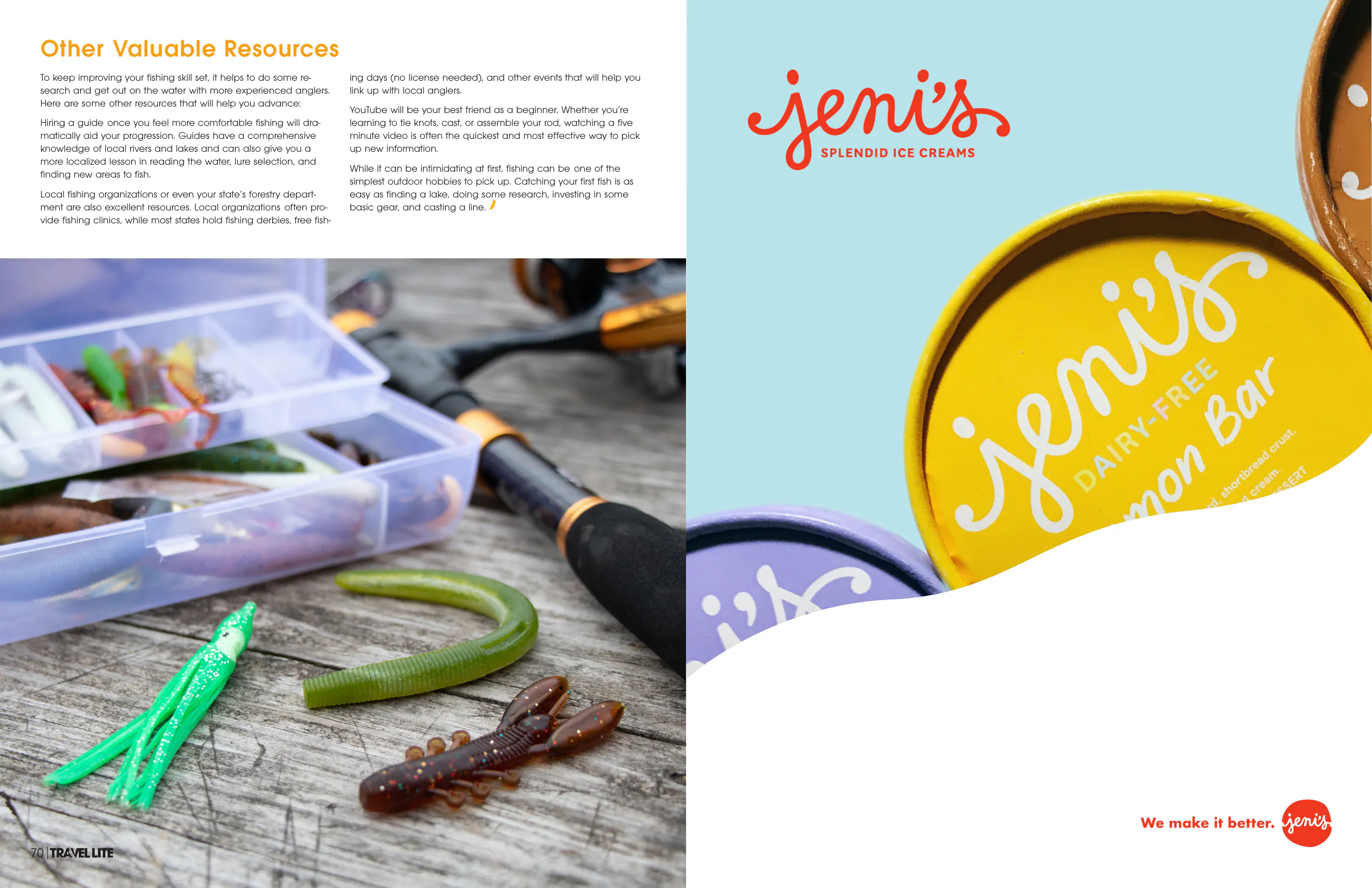 Opens the full-size image in a new tab.
From Worm to Fish: Concluding Spread, pages 70 and 71.
Project Details
Editorial Design
I created Travel Lite Magazine as part of an academic group editorial-design assignment with four fellow students. The project focused on the intersection of professional layout and brand identity in an academic travel magazine.
At the beginning of the project, we selected our own responsibilities, with each role agreed upon by the group. As Creative Director and Editor, I developed the magazine’s visual identity, designed the Travel Lite logo, established its typography and layout system, and wrote the opening Letter from the Editor. The design system uses a dark navy blue palette with gold foil accents and editorial serif typography.
To concentrate on visual design and layout, the team used previously published articles for editorial copy. This allowed the focus to remain on using photography, typography, and layout to establish visual consistency across the publication.
Featured Content
The following selections showcase my contributions to the publication’s layout and visual storytelling. The article copy in these features was written by others.
- Opening Advertisement & Editorial: The magazine opens with a full-page American Airlines advertisement and the Letter from the Editor. I designed the advertisement and wrote the editorial.
- Lockport: Stepping Back in Time: A multi-page feature on the Illinois & Michigan Canal district, including the historic Gaylord Building. I provided both the architectural photography and the editorial layouts.
- The Churchill: An editorial spread about The Churchill, a shipping-container food and retail park in downtown Phoenix. I was responsible for the editorial layout.
- Little Miss BBQ: An editorial spread about Little Miss BBQ in Phoenix. I provided the photography and layout.
- From Worm to Fish: A beginner-friendly fishing guide. I provided the layout and imagery for this feature.
Advertising & Photography
Beyond editorial content, I designed advertisements for American Airlines, College of DuPage, Arizona, and AAA, using a consistent typeface to maintain visual continuity throughout the publication. Selected advertisements are presented in the portfolio.
My photography appears in the Lockport and Little Miss BBQ features. The layouts use generous whitespace and a restrained typographic hierarchy.
Collaborators
The project was a collective effort by a five-student production team. I oversaw the visual identity and production.
Student Production Team: I worked with four fellow students: Conner Kastelein, Yiou Yang, Angela Bello, and Povilas Baranauskas.
Original Article Contributors: This project utilized existing published articles from sources such as West Suburban Living, Phoenix New Times, and Outside Online. The writers of these articles are credited within their respective spreads.