
Brand Identity · Logo Design, Typography, Illustration
MilDot Apparel
A hand-lettered logotype for a military-inspired apparel concept, drawn from veteran culture and optical design.
Project Details
Logotype Design
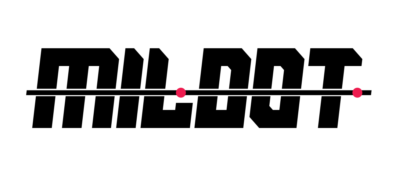
I designed a hand-lettered logotype for a military-inspired apparel concept. The mark uses type as its primary visual element: legible at a distance, readable at small scale, and grounded in a military aesthetic.
Research
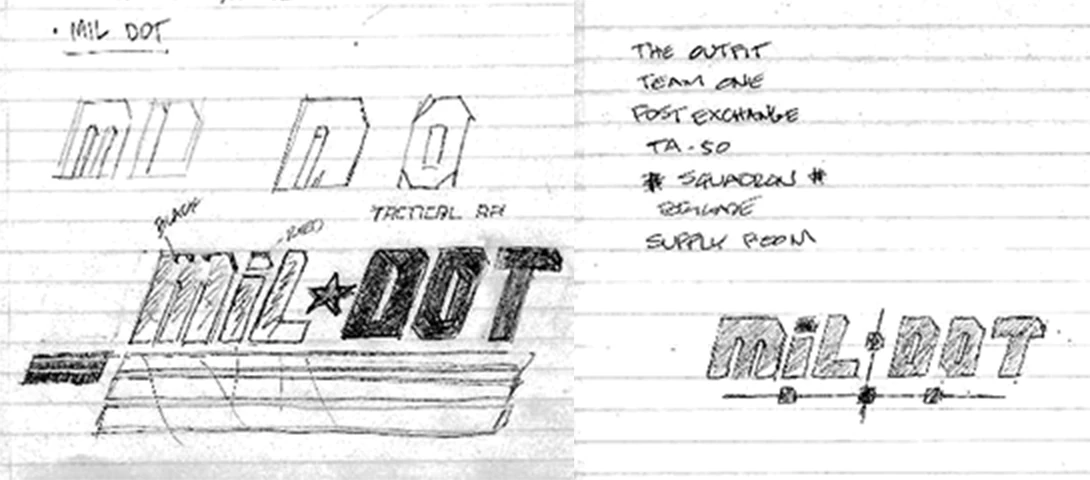
The concept drew from military-inspired clothing lines such as Article 15, Grunt Style, and Nine Line. I explored a range of potential names rooted in military terminology: The Outfit, Team One, Post Exchange, TA-50, Squadron, Brigade, The Supply Room, and MilDot.
Ideation and Sketches
I settled on MilDot: a unit of measure used in weapon system optics. As part of the naming process, I researched whether MilDot was already being used by an apparel brand. My research at the time did not identify an existing brand using the name.
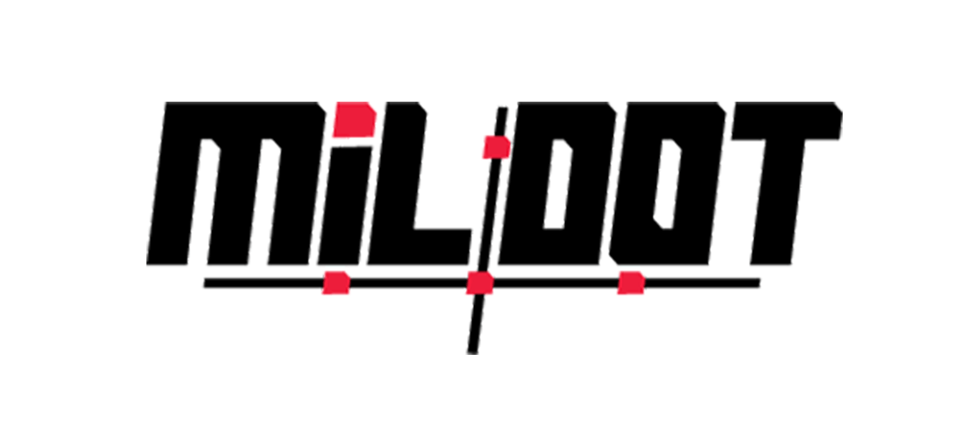
A mood board collected brands whose visual language aligned with the direction I wanted to explore. I produced two preliminary sketches. The first closely resembled the "GI Joe" brand; not necessarily a problem, given the military audience. The second sketch replaced the lines and star with a reticle cross and mil-dot marks, the way they would appear through a scope.
Digital Concepts
I traced the preferred sketch and refined it digitally, paying close attention to legibility, proportion, and the balance between the letterforms and the reticle elements.
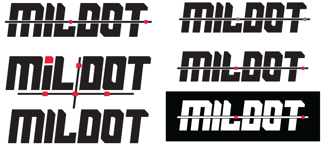
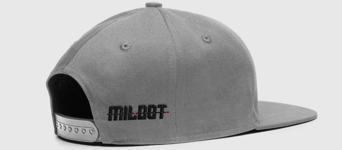
The color palette is minimal: black and white as the primary colors, with a single red accent for the mil-dot marks. The red references the reticle and adds a bold, functional detail without competing with the logotype.
Revisions
I reviewed the type design and adjusted the letterforms for consistency: equalizing stem widths, tightening spacing, and ensuring the reticle cross did not overpower the wordmark. These refinements made the logo feel more polished and intentional.
Final Design
The final mark was produced as an embroidered logo on a baseball cap, the way it would appear on actual apparel. The project deepened my understanding of how lettering and illustration work together as a unified visual identity; and how much a careful reduction can communicate.