Illustration · Logo Design, Sports Branding
Leaping Lizards
An illustrative logo for a fictional basketball team, the North Aurora Leaping Lizards, rendered in orange, green, and red.
Project Details
Sports Team Logo
I designed an illustrative logo for a fictional basketball team: the North Aurora Leaping Lizards. Rendered in three colors (orange, green, and red) with tints for shading and accents, I completed this project for a Digital Illustration class at the College of DuPage in the Spring of 2017.
Concept
The brief was to find an unusual animal that embodied the key attributes of basketball. A lizard felt right: quick, nimble, and naturally athletic. The shape of a lizard: low to the ground, explosive in motion; mirrored the agility and speed of the sport. Lizards also have a distinctive, memorable silhouette, which made them well-suited for a logo.
Ideation and Sketches
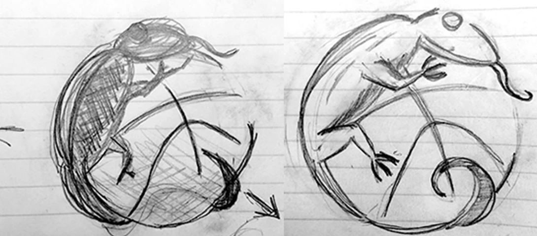
I sketched a rough outline of a lizard hugging a basketball, aiming for a simple, recognizable composition. The goal was to keep the shapes minimal; fewer details meant the color palette could do more of the work. I explored a few variations before settling on one that felt balanced and dynamic.
Digital Concepts
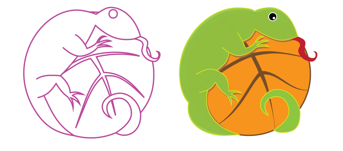
I moved the chosen sketch into Adobe Illustrator CC, using vector tools to define the final proportions and clean up the lines. The three-color requirement shaped the entire process: I needed a palette that was bold enough to read from a distance but harmonious enough to feel intentional. I experimented with several color combinations, adjusting the balance between orange, green, and red until the composition felt cohesive.
Revisions
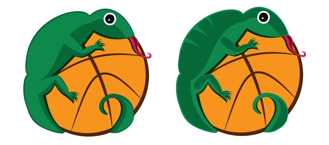
Once the three colors were applied, I reviewed the design closely and narrowed the options to two stronger versions. I presented both to the class for peer feedback. The consensus favored the first iteration: its shading and form were stronger, but there was agreement that the stripes on the lizard’s back were distracting. I removed them, which simplified the figure and improved the overall composition.
Final Design
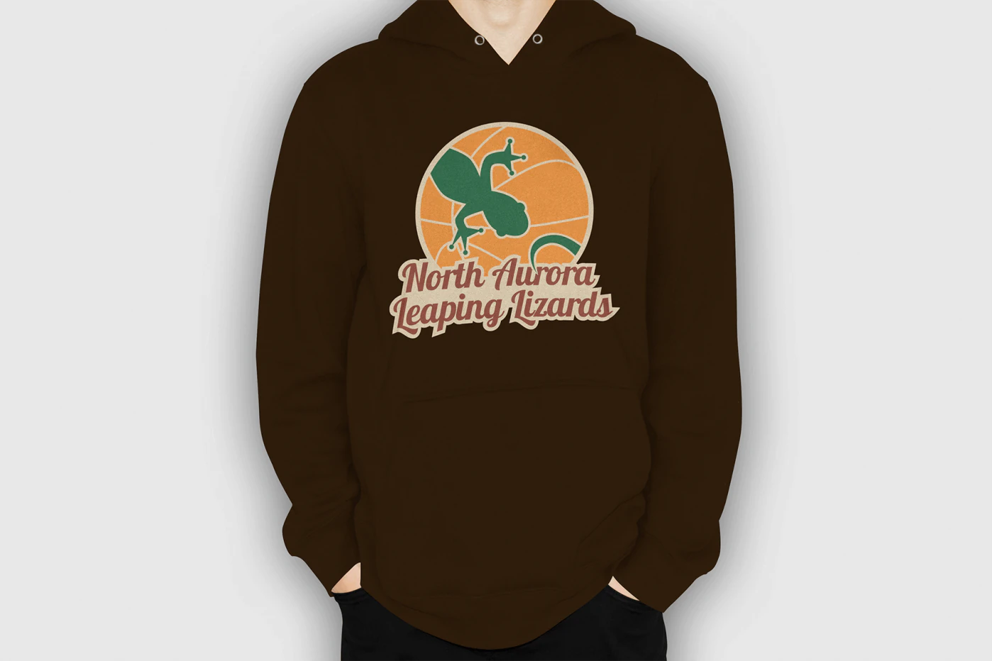
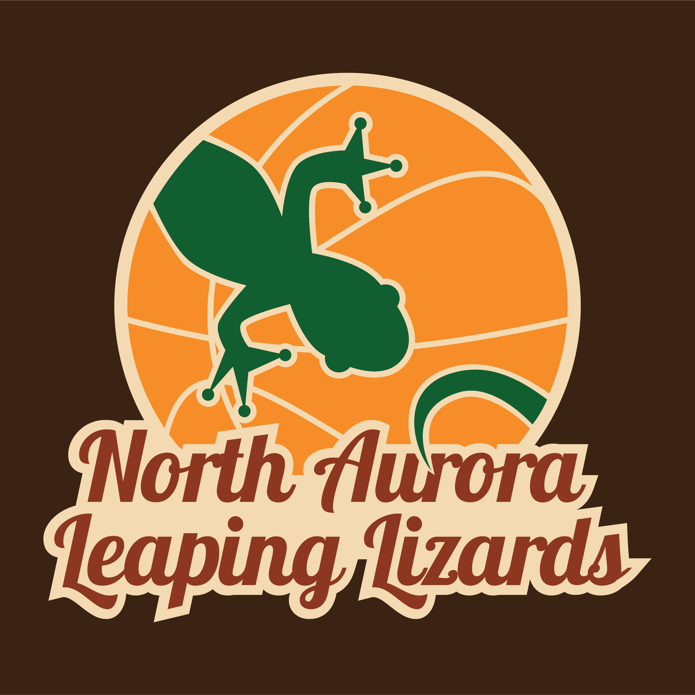
The final logo was refined to emphasize a modern, flat aesthetic. I streamlined the lines, reduced visual clutter, and adjusted the color palette for maximum impact. The result was a clean, contemporary mark that works well on apparel and merchandise: a team sweatshirt, a hoodie, a poster, without losing its character at any scale.