
UX Design · Interface Design, Mobile
Il Maresciallo Restaurant
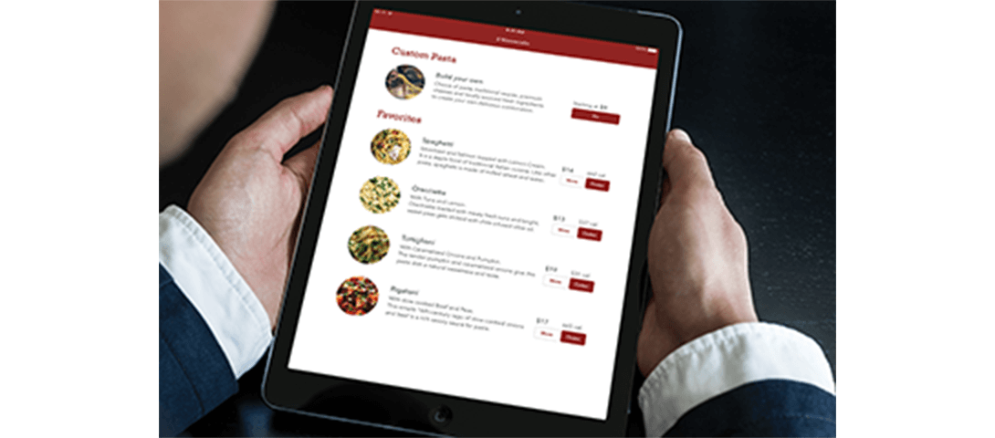
An interactive iPad menu for a fictional Italian restaurant, designed around ease of ordering and visual clarity.
Project Details
iPad Menu Interface
I designed the user experience and interface for an interactive digital menu at a fictional Italian restaurant. The concept explored how a self-service tablet could deliver a warm, human experience: the challenge was making a screen feel approachable rather than transactional.
Research
The menu was built for a fast-casual, made-to-order pasta concept. The target audience was working professionals aged 18–35 who valued fresh ingredients and were comfortable with technology. The ordering flow needed to be intuitive: customers should be able to browse options, customize their selections, and place an order without friction.
Ideation and Sketches
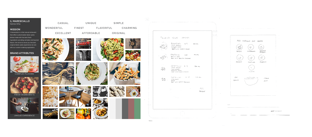
The restaurant name, Il Maresciallo, refers to a senior rank in the Italian Carabinieri. I chose it to evoke a sense of tradition and quality, while the menu itself was meant to feel contemporary and approachable.
A mood board established the visual direction, collecting brands whose aesthetic aligned with the Italian fast-casual concept. I sketched two preliminary layouts to test different menu structures before committing to a digital framework.
Digital Concepts
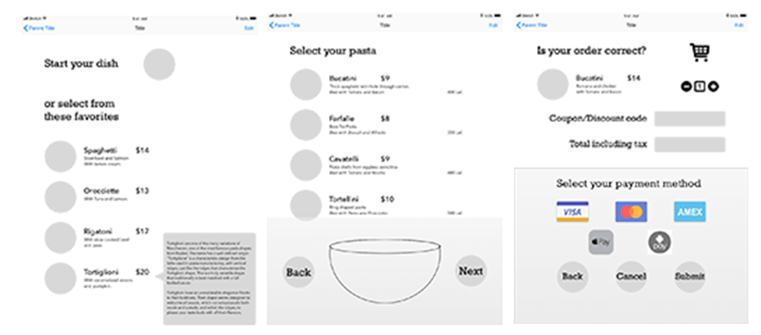
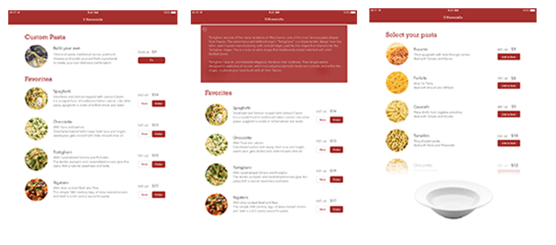
The interface prioritized legibility and proportion. Every element needed to be readable on a tablet screen: from body copy to navigation labels, and visually balanced across the available space. The color palette was kept minimal to let the food photography and typography carry the design.
Revisions
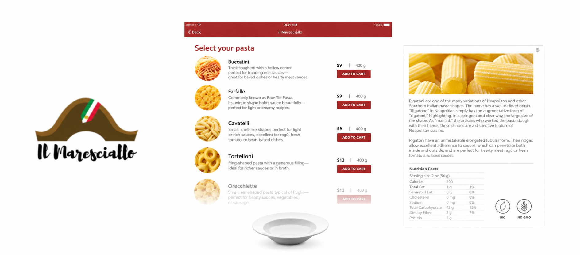
I refined the typeface details during the final design phase: letter spacing, character height, and overall font weight were adjusted for clarity. Each letter was carefully formed to ensure sufficient contrast against the background, and the spacing between characters was fine-tuned to improve readability at a glance.
Final Design
The final interface was presented in an iPad mockup. The project reinforced the value of iterative design; small, deliberate adjustments often have more impact than sweeping changes. The result was a menu that felt clean, organized, and easy to navigate.