
Web Design · Responsive Design, Icon Design
The Crunchy Kale
A recipe and content blog redesign using color, typography, and an icon set instead of photographs.
Project Details
Single-Page Website
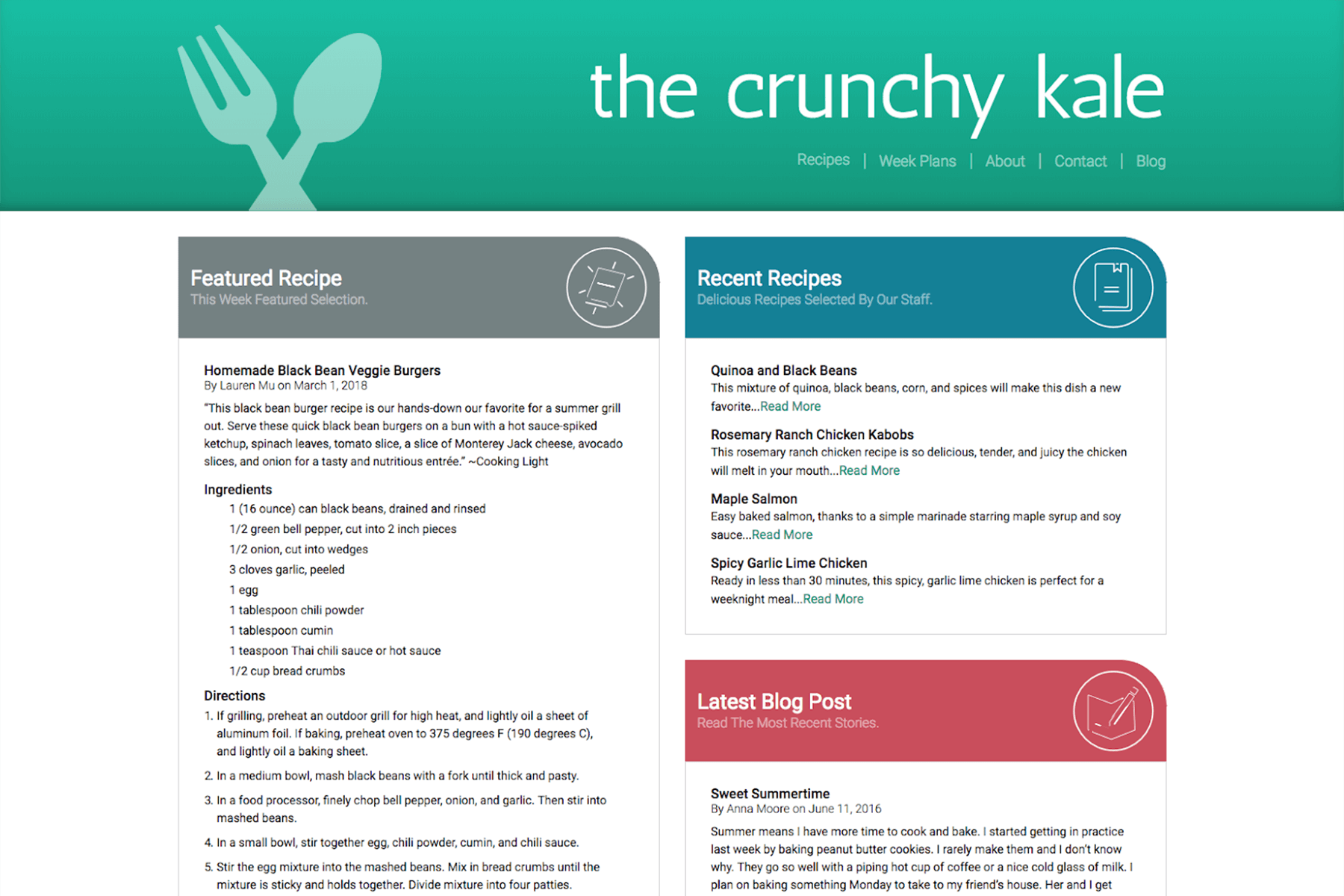
This was my first project in a Web Design class: a recipe and content blog built without photographs. The brief required creating visual interest through color, typography, and a custom icon set. The copy and site structure were provided; the challenge was making it feel cohesive and engaging.
Research
I reviewed existing recipe and cooking blogs to understand how they organized content and used color. I looked at the range of layouts and palettes available, noting which ones felt fresh and which felt dated. The goal was to find a direction that stood out without relying on imagery.
Ideation and Sketches
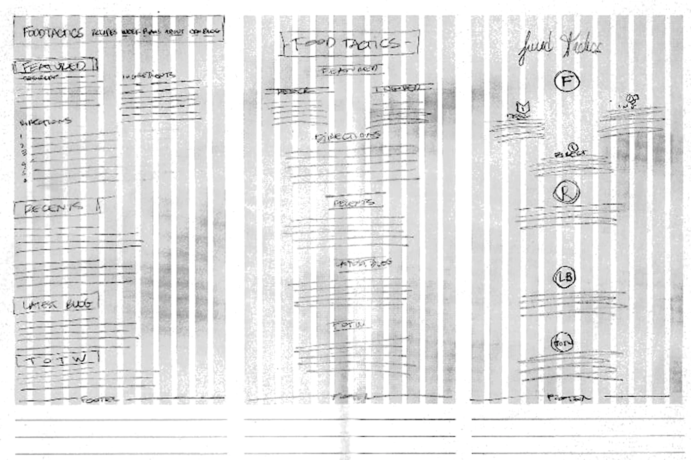
I explored a few layout options, designing a menu structure that guided the user to different sections based on the categories provided. I used the given copy to estimate the size of each section and determine what type sizes and colors would create a clear hierarchy.
Digital Concepts
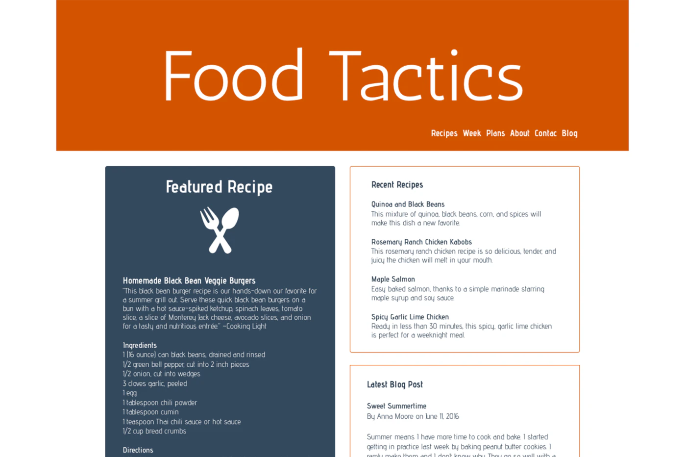
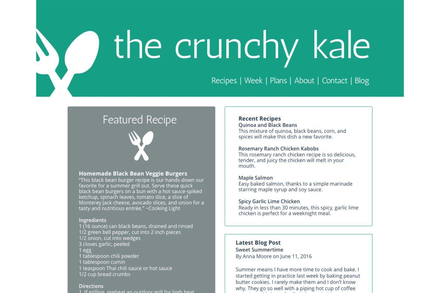
I produced a few digital drafts to test the layout. After instructor and peer feedback, I restructured the page for better legibility and began designing a custom icon set to replace the missing photographs. I also experimented with color-coded headings to help each section stand out.
Revisions
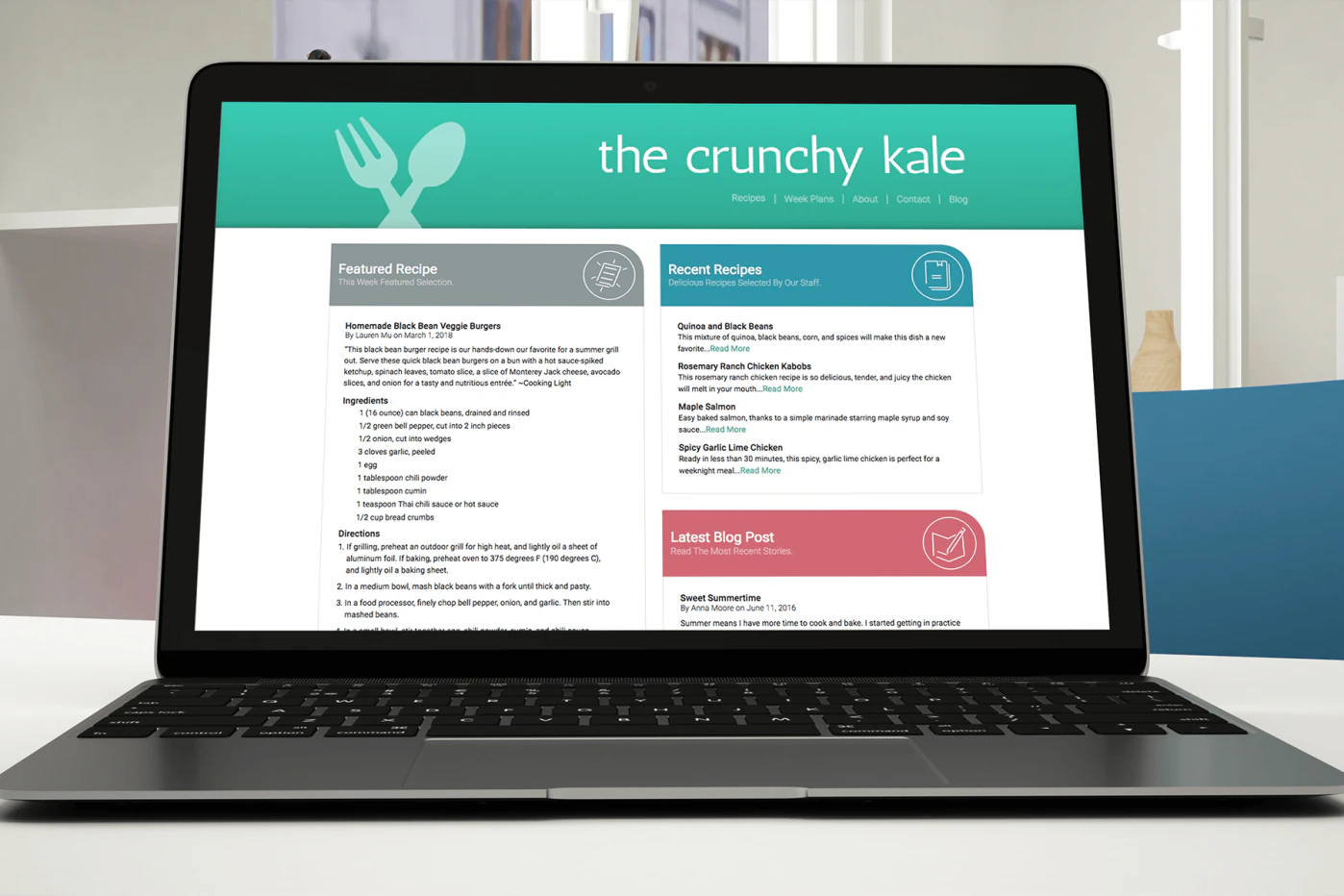
I finalized the page layout, logo, and icon set. The site was renamed The Crunchy Kale during this phase. The focus shifted to refining the details: spacing, type scale, and the overall visual rhythm of the page.
Final Design
The header received a drop shadow to add depth, and the remaining elements were fine-tuned for spacing and hierarchy. Working without photographs was a real constraint; it forced me to rely entirely on typography, color, and icons to create visual interest. The result was a clean, organized layout that demonstrated how much information could be communicated without imagery.