Camping Website
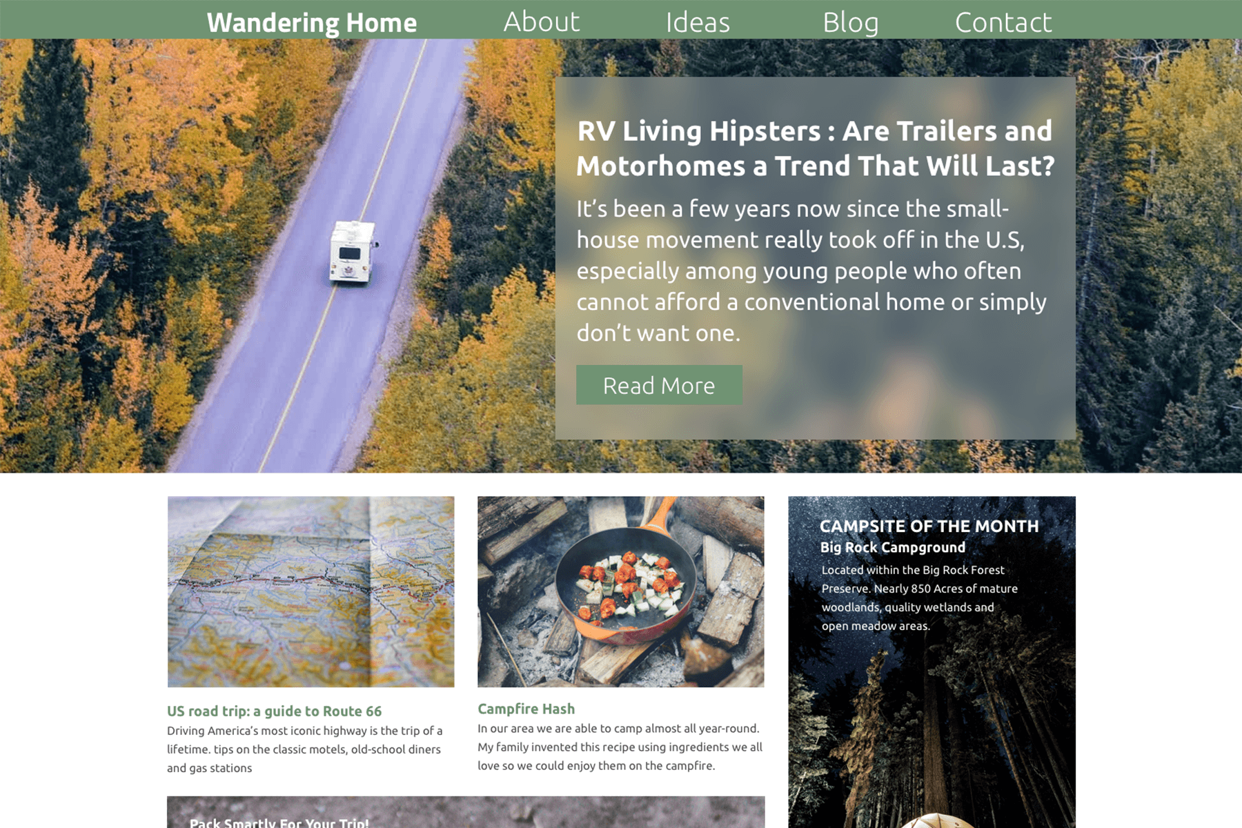
Wandering Home
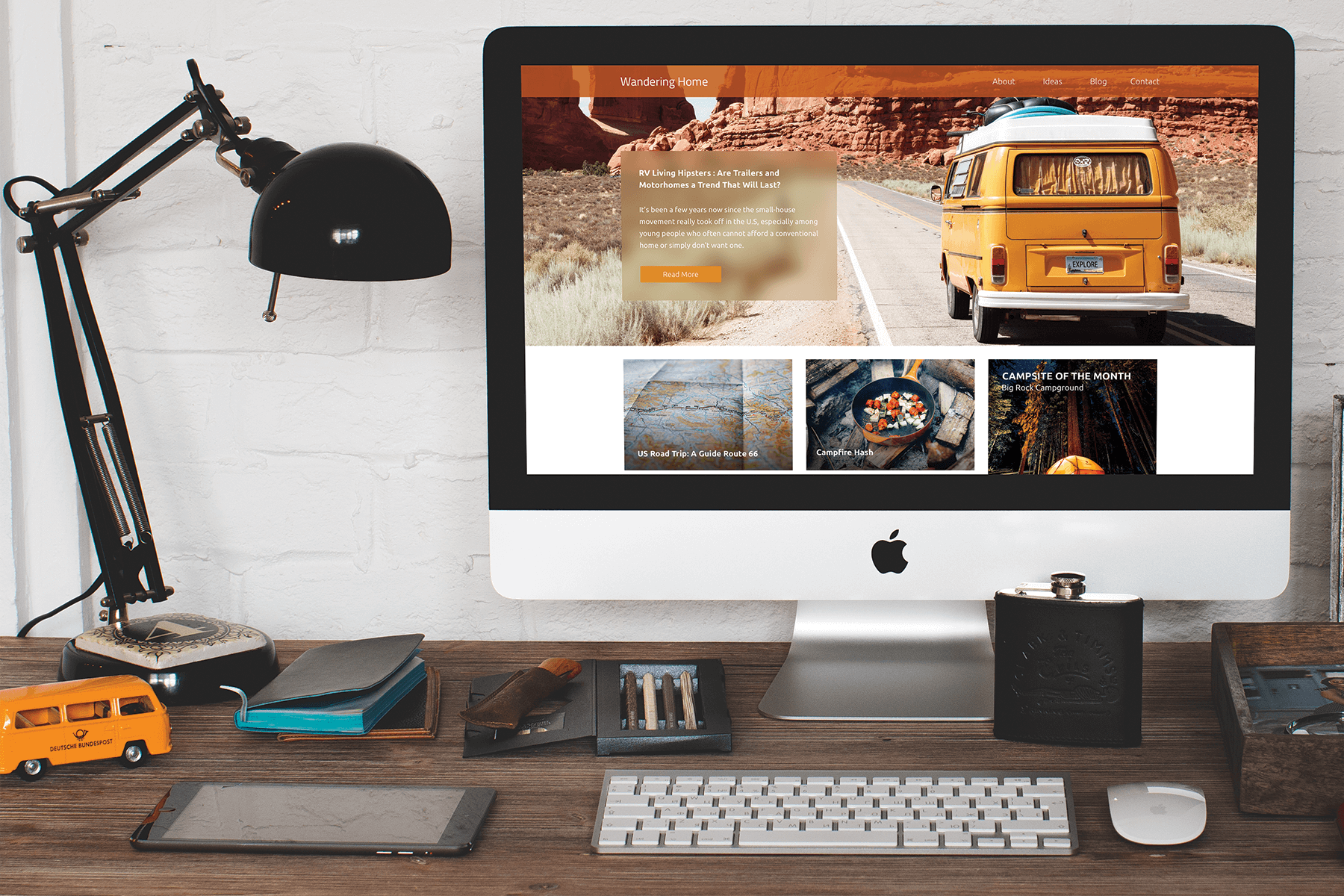
The goal of this project during the User Experience Design class was to create a website with an e-zine style design. I had to find a topic of interest and decided to go with a Camping and RV site. This site could contain different articles of interest as well as reviews. The tools primarily used for this project, in particular, were SketchApp and InVision.
Research
I started looking at similar camping and RV sites to gather some ideas as to what the style of the page should be. What color palettes were used, and which ones look more appealing and visually attractive to me.
The Process
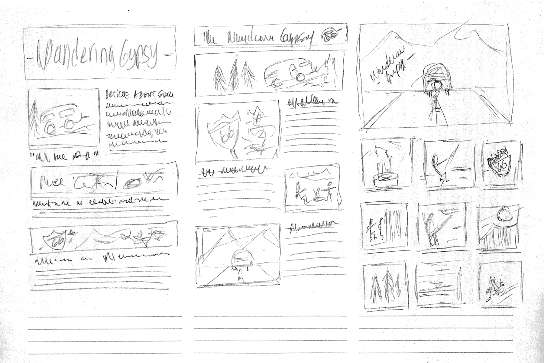
Ideation And Sketches
I wanted to create a fluid layout so the user could navigate through the main page and select which articles to read.
The initial name for the site was Wandering Gypsy. But the instructor suggested that the name had a negative connotation and could be considered offensive, so it was changed to Wandering Home.
Digital Concepts
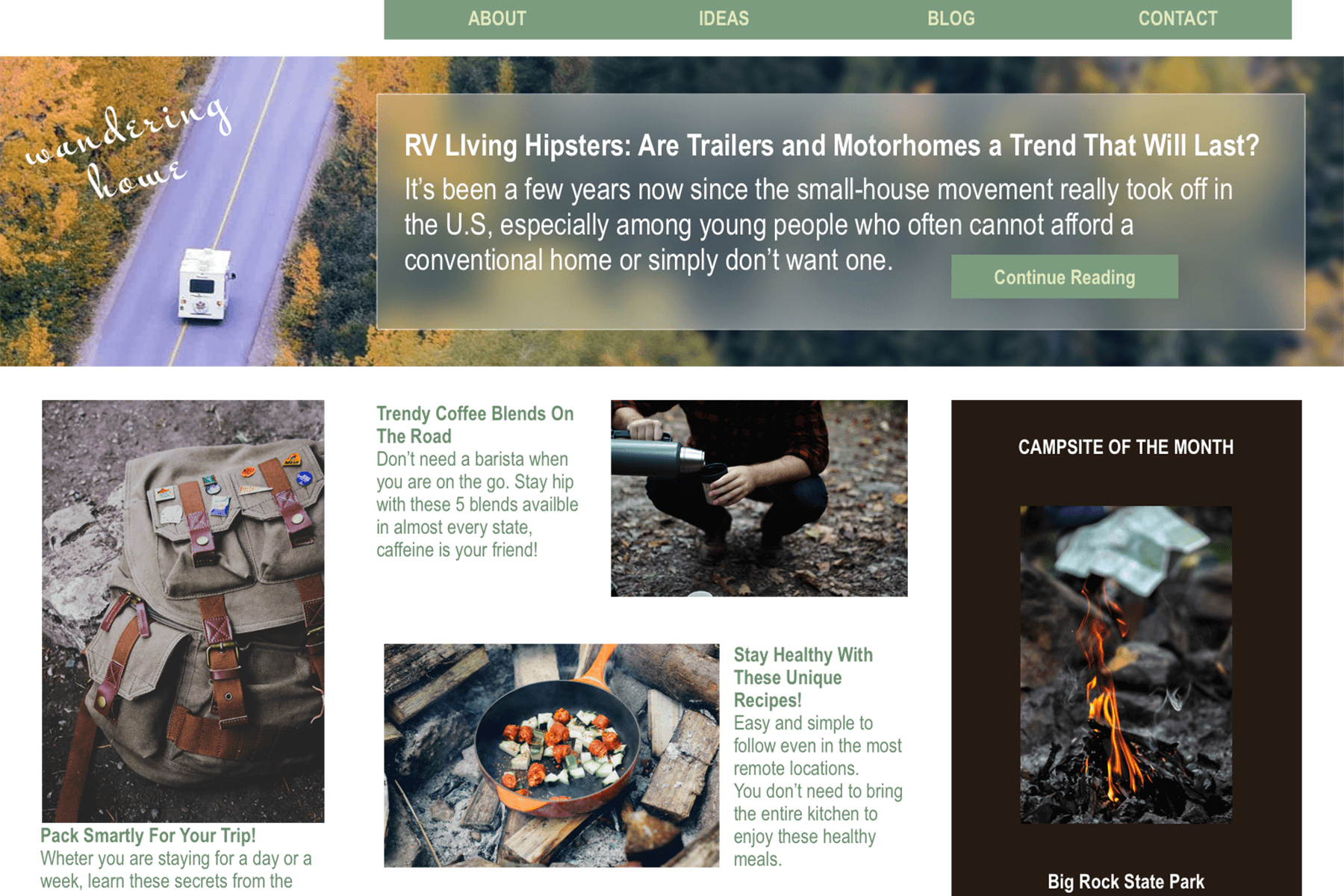
I created a few digital concepts with an idea of the layout. With initial instructor and peer feedback, some of the elements were re-arranged, and attention was given to spacing and type selection.
Also, at this point, I started looking for stock photography that would suit the website's content well, along with having a more hipster/Instagram look.
Revisions
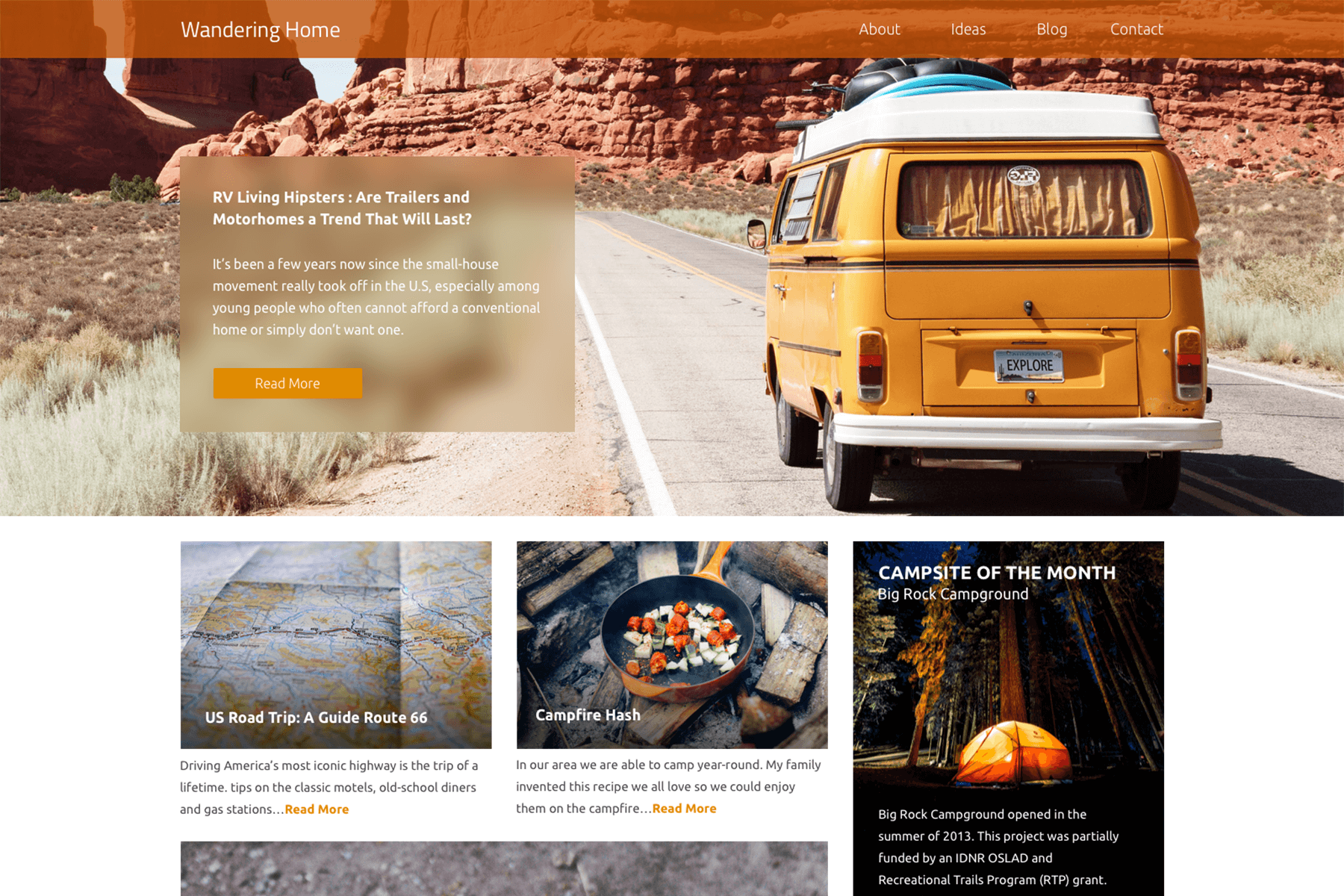
I did a lot of work on the header portion of the site, particularly with the frosted glass effect and hero image. I also worked on the navigation and replaced the display typeface with a sans-serif for a cleaner look.
Final Design
I Did a little bit more re-arranging and fine-tuning of the look and felt, and while the green outdoorsy look worked great, I tried using a warmer color palette and shifted to orange.
I've also found a typeface that gave the site a more modern and contemporary look and worked on the final details of proper spacing and hierarchy.