Magazine Layout Design
Two days in Rome
Designed and produced a letter-size independent magazine (20 interior pages + 4-page covers) featuring college student life and culture from student-authored articles and photography.
Research
Magazine name and tag line: Created a magazine title and tagline for the publication. Defined a target audience: The magazine's target audience is college students. The magazine category is Lifestyle. Authored Article: This included conducting research and composing the article clearly and engagingly. I also contributed to the visual elements of the piece, including selecting and editing photographs and other imagery that supported the story and enhanced its impact. My goal was to produce a comprehensive and well-rounded article that would inform and educate readers while capturing their attention and holding their interest. Through my efforts, I created a piece that effectively communicated the intended message and made a lasting impression on its audience.

The Process

Ideation And Sketches
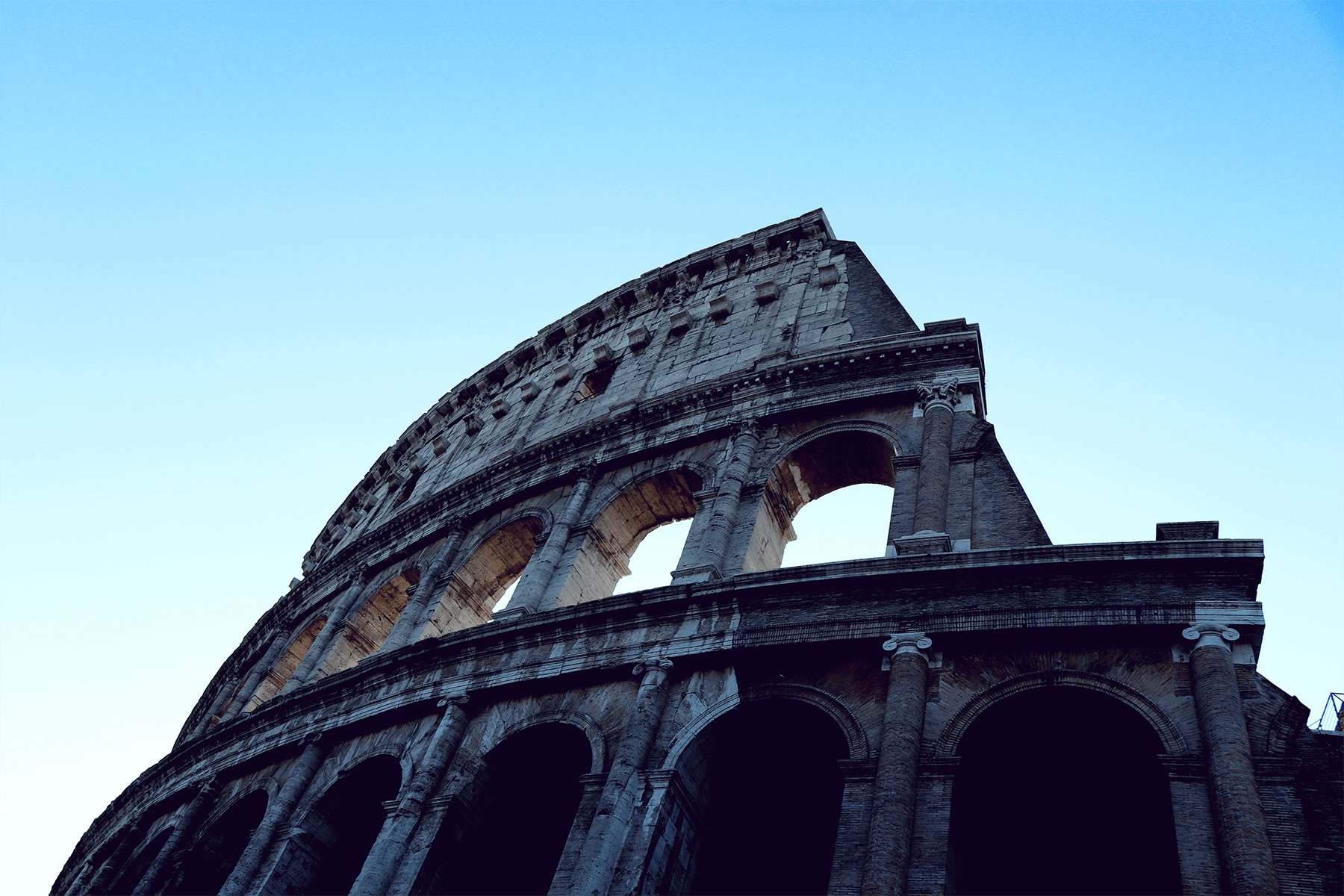
I decided on a travel article detailing a two-day itinerary for visiting the magnificent city of Rome. I was fortunate enough to have photographs from a previous trip that I used to illustrate my article. I also carefully followed a tour guide document to ensure that my readers received the most comprehensive information. This itinerary will take the reader through some of the city’s most iconic landmarks and historical sites, including the Colosseum, the Roman Forum, the Pantheon, and many more. I provided detailed information on the history and significance of each location, as well as tips on making the most of their time while visiting.
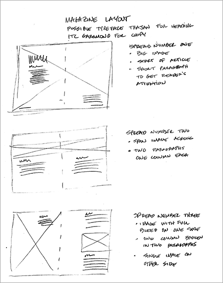
After an initial set of thumbnails, I created the basic spread layout and possible typefaces that would work best with the overall look and feel I was trying to achieve. I chose spreads to have an interesting look across the six pages needed for the article.
I also had to collect photography and copy from three other students to generate the additional spreads needed to complete the twenty-page magazine. The most challenging aspect of this was to create unique-looking designs for each one of them while having a consistent look across the publication. Despite the challenges, I coordinated successfully with each student and gathered the necessary materials promptly. The final product was well received by the class and received praise for its professional appearance and cohesive design.
Photography
For the article title, I chose the classic and elegant typeface Trajan, known for its iconic and timeless appearance. Meanwhile, the more traditional Garamond ITC was selected for the headings and primary body copy to balance the visual hierarchy and ensure readability. These typefaces were chosen to communicate the desired tone effectively and enhance the overall design aesthetic.
Based on feedback from my peers and instructors, I concluded that the overall layout required more negative space to achieve a harmonious balance. I carefully selected images and adjusted them to add visual appeal and enhance their impact. The process involved experimenting with different techniques, such as cropping, resizing, and adjusting color and brightness to create the desired effect. With each iteration, I sought further feedback to ensure that the changes aligned with the intended design concept and met the criteria for a compelling visual presentation. Ultimately, I was able to create a cohesive and impactful layout that successfully communicates my message through the use of adequate negative space and visually engaging images.


Revisions
Developing a design that looked well-balanced took a few attempts. I realized that it was crucial for me to get the right hierarchy in place by utilizing appropriate typography. Every element in the design had to play its part in creating an overall cohesive look. I experimented with different font styles, sizes, and colors to see what worked best and what didn’t. Finally, after a few iterations, I was able to create a design that was not only aesthetically pleasing but also conveyed the message effectively.
Incorporating negative space into the design was critical to add visual variety and interest. I used the negative space to lead the viewer’s eye throughout the composition, guiding them to the critical elements of the design. The strategic use of negative space added an extra layer of interest and helped balance the composition, preventing it from becoming too cluttered. This simple yet effective technique created a visual hierarchy, making it easier for the audience to understand the message. I created an aesthetically pleasing design with this approach and effectively communicated the intended message.
Final Design
I took the InDesign file and created a PDF to complete the project. I paid close attention to the resolution and quality of the images and text to ensure that the final product would look professional. In addition to the digital version, I also created a printed version which I sent out to a professional printing company called Blurb.
Throughout the length of this project, I discovered the importance of using negative space effectively, enhancing the overall aesthetic of composition, and creating a harmonious balance. I learned that negative space could draw the eye toward the focal point, add visual interest and create a sense of unity in a design. Furthermore, I realized that negative space plays a crucial role in determining the readability and legibility of text, making it an essential aspect of graphic design. This project has opened my eyes to the power and versatility of negative space, and I now understand why it is considered a fundamental principle in design. I am eager to apply what I have learned and experiment with negative space in my future projects to see how it can shape my designs’ visual appeal and impact.
