Content Based Website
The Sprocket and Chain
The objective of this project was to create an informative hobby-based website which I chose to do on motorcycle and motorcycle gear blogs and reviews. I thought it would be ideal for providing relevant content to Harley Davidson bobber/chopper-style bike riders. Very few blogs cover this type of bike specifically and do it excitingly. This project proved challenging since we were limited to only using three images, so the layout and color palette would have to capture the visitor's attention.
Research
During my research, I found that just a handful of websites were well-designed and presented this information clearly to the target audience. I gathered a few articles that caught my attention and used that as copy.

The Process

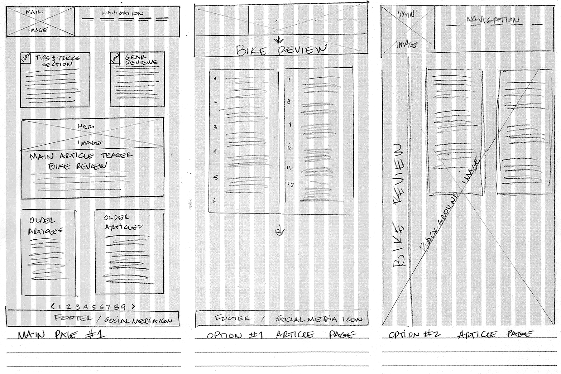
Ideation And Sketches
I had a pretty good idea of which direction to take as far as the main page's layout was concerned, but I presented two options for the secondary page. Based on the instructor and peer feedback, I started creating the wireframes to get a better idea of size and proportions, as it was required to use flexbox during the coding phase.
The other critical aspect was looking for the right images since the project was limited to only three pictures. The right size and placement would make or break the visual interest aspect of the web pages to be designed.
Digital Concepts
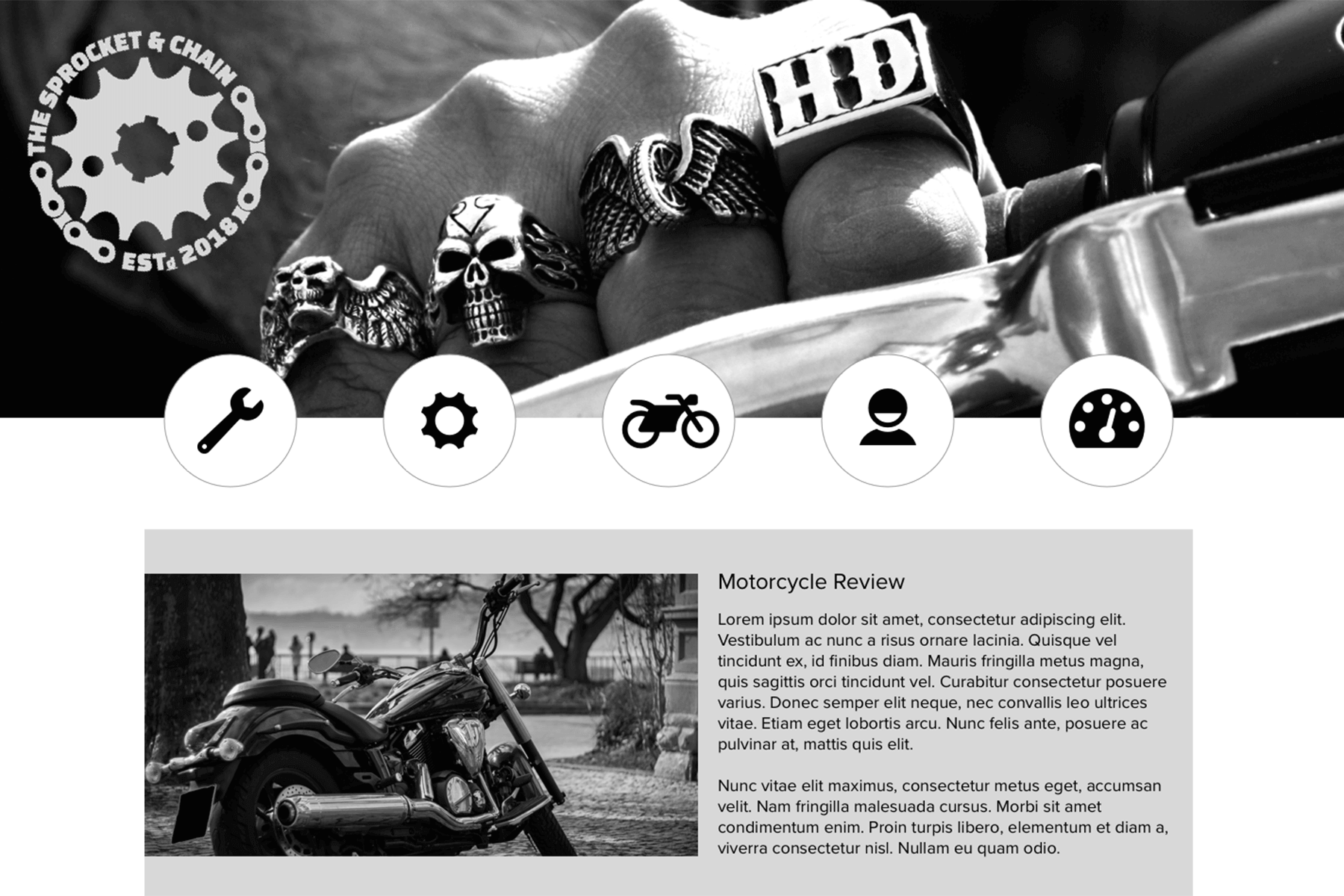
In this design phase, I was primarily concerned with creating an icon set that would fit the motorcycle theme I had in mind. In addition to that, I had a few iterations of the logo and wanted to create a unified look for the entire build. After the instructor and peer critique, I decided on a simplified and modular approach to the logo implementation for this webpage.
I had initially used my photography, but as the development of the page continued, I found a couple of royalty-free stock images that fit the top banner better.


Revisions
I had finalized the icon set and for the navigation and simplified the logo one more time, so the next step was working on fine-tuning the page and focusing on the coding portion of this project.
Final Design
Some minor changes and adjustments were made to the final version of the two pages and some of the code to make it work with the secondary page.
Overall, it was a very challenging project that helped me better understand design aspects and clean and organized code to create a visually pleasing webpage.
