Interactive iPad Menu
Il Maresciallo Restaurant
Designed the interface and user experience for an interactive menu at a fictional restaurant. As companies explore a dining experience devoid of human interaction, the applications that customers interact with still need to be decidedly human.
Research
For this project, I created a menu for a fast-casual custom, made-to-order fresh Italian pasta. Ease of use when ordering and the unique combination of pasta, sauce, and toppings were important to the demographics of 18-35, working professionals that value fresh ingredients are time conscious and tech-savvy.

The Process

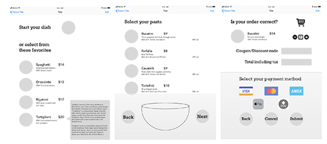
Ideation And Sketches
Decided to go with the name of Il Maresciallo, which means The Marshall in Italian; this is a senior ranking enlisted in the Italian Carabinieri.
My mood board was an essential part of my creative process as it helped me define the aesthetic direction I wanted to take with my project. To create it, I carefully selected some of the top brands in my industry that I felt aligned with my vision. I also chose a specific typeface that caught my eye and inspired the typography I wanted to use. Additionally, I included two preliminary sketches of my final designs. These sketches allowed me to experiment with different ideas and ensure I was on the right track before moving forward with the final product.
Digital Concepts
I wanted to make sure that my final design accurately represented my initial sketch and vision. During the process, I kept two critical factors in mind - legibility, and proportion. I wanted to ensure that the design was easily readable and that all the elements were proportionate to one another. This was crucial, as the design was meant to be viewed by a large audience, and I wanted to ensure that it was accessible to everyone.
When it came to selecting colors for the design, I decided to keep things simple and use the least number of colors possible.


Revisions
As I was finalizing the design, I made a few minor adjustments to the typeface to ensure it was perfect. I paid close attention to the details, such as the spacing between letters, each character’s height, and the font’s overall weight. I wanted to make sure that the type was legible and easy to read, so I made sure that each letter was well-formed and that there was sufficient contrast between the type and the background.
Final Design
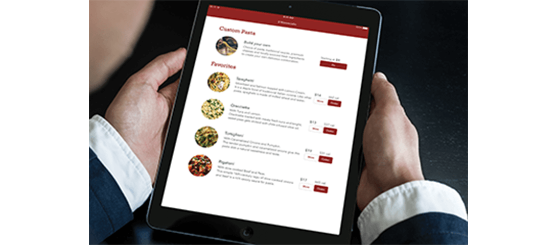
Final design mocked with an iPad.
This project also taught me the value of iterative design and the importance of making adjustments and improvements along the way. I realized that UX design is not a one-time process but an ongoing journey that requires continuous improvement and refinement.Overall, this project opened my eyes to the limitless possibilities of UX design. I learned the importance of considering the end-user and their needs when creating a design and the significance of creating an intuitive and user-friendly interface
