Single Page Website
The Crunchy Kale
For this first project in Web Design One class, we were given the copy and the general idea of organization on what the site needed to be about mostly a recipe/content blog website. We were asked not to use images, so we needed to create visual interest by use of color, typography, and a well-designed icon set.
Research
I looked at similar recipe and cooking blog websites to get some inspiration and see what the existing designs looked like. Also, to get an idea of what color palettes and overall layout were used."

The Process

Ideation And Sketches
I decided to explore a few options in terms of layout for the page and create a menu of options that would take the user to sections of the website based on the categories given to us.
I also used the copy given to estimate the sections' size and determine what colors and type to use to create proper hierarchy and visual interest.
Digital Concepts
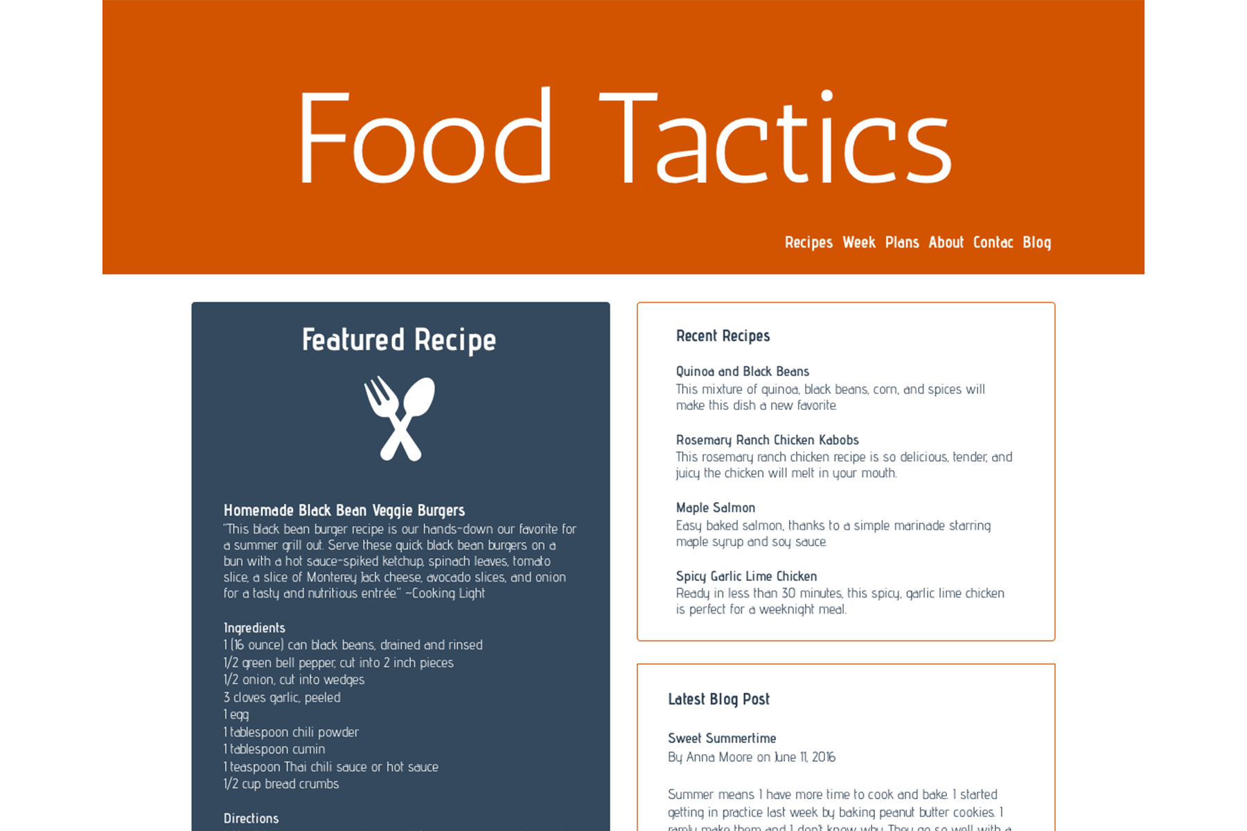
Here is a sample of what the initial digital concepts looked like; based on instructor and peer feedback, I made a few changes and structured the page for better legibility.
I also started to design an icon set for the different sections of the page, again to create visual interest. It was also suggested that different color headings would make the page stand out more.


Revisions
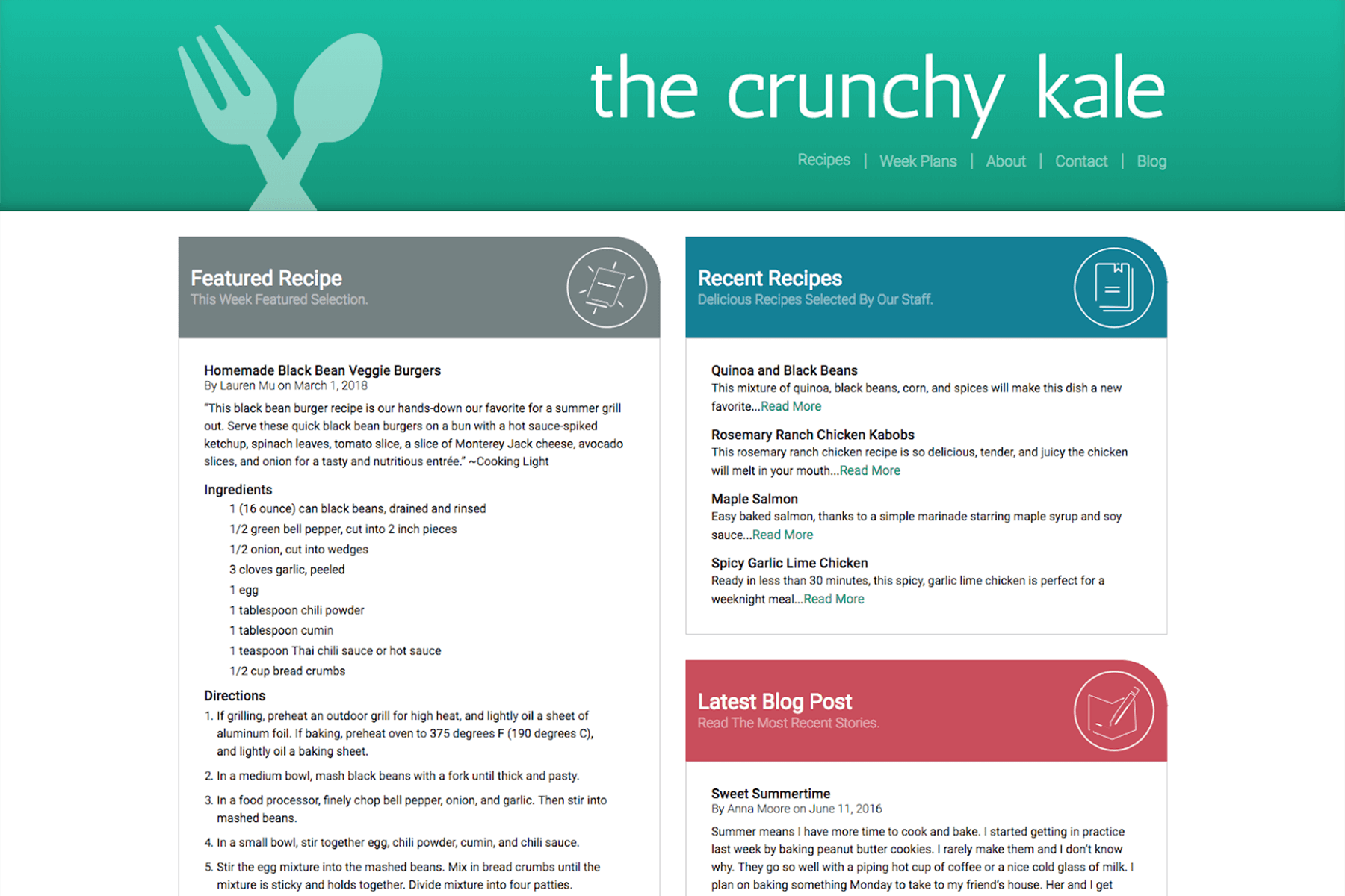
During this project phase, I finalized the look of the page, the logo, and the icon set. The site was also renamed The Crunchy Kale.
Final Design
For the final design, a drop shadow effect was given to the header to create some depth and minor adjustments to the page.
The biggest wins for me on this project was seeing how the original design improved over time and learning to use HTML/CSS and flexbox. Also, creating a unique non-pictorial logo and icon set for the page to create some visual interest, as working without images to convey information proved to be very challenging.
